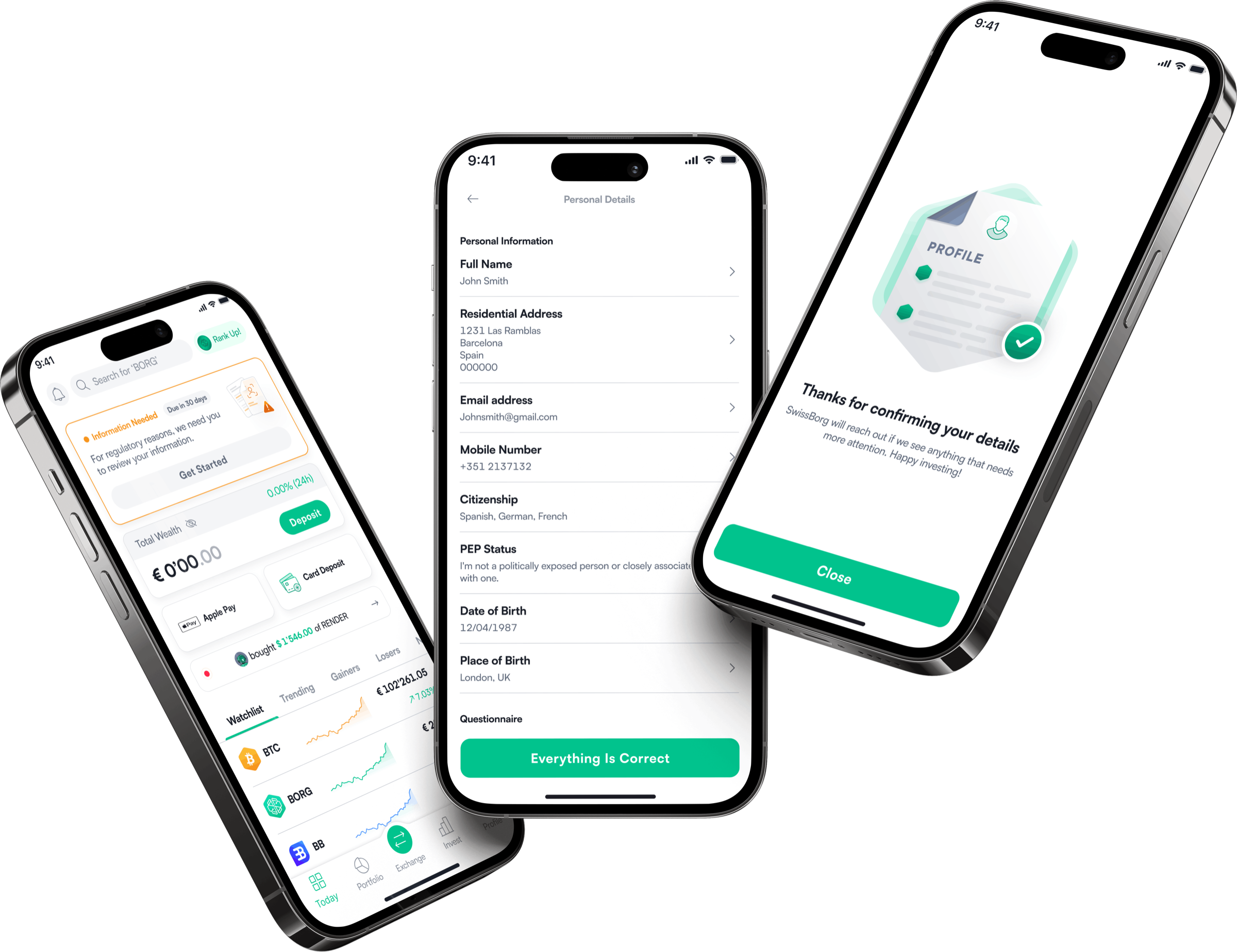
Why read this case study?
This case study is not just the polished outcome. It covers the research, the internal conflicts, the scrapped designs nobody usually sees, and the decisions that shaped the final solution. A deep dive into my thinking methodology.
Overview
SwissBorg operates in a regulated environment where user data must remain accurate by law. With over 700,000 users needing to reconfirm their information within a year, and no self-serve way to do it, the platform faced millions in potential fines. I designed a guided in-app renewal flow that handled it at scale with virtually no friction and no support dependency.
The Problem
Hundreds of thousands of users needed to confirm their data and there was no way to do it without contacting support.

Any change to name, address, or identity required users to contact support manually, creating a bottleneck that couldn't scale.

Users had previously been prompted via email with no in-app path to complete renewal, leading to low completion and no visibility.
If after 30 days without confirmation, the entire app locks. Users cannot continue until they comply.
If SwissBorg failed to confirm user data at scale, the platform faced millions in fines and potential license suspension.
What I shipped
Not a quick fix for one compliance request. Three pieces of product that kept working long after data renewal was over.

Before, users couldn’t change their name or address themselves; every change went through support. Data renewal meant thousands of users might need to, and support couldn’t take that load, so I shipped the feature that lets users update their own name and address in the app.
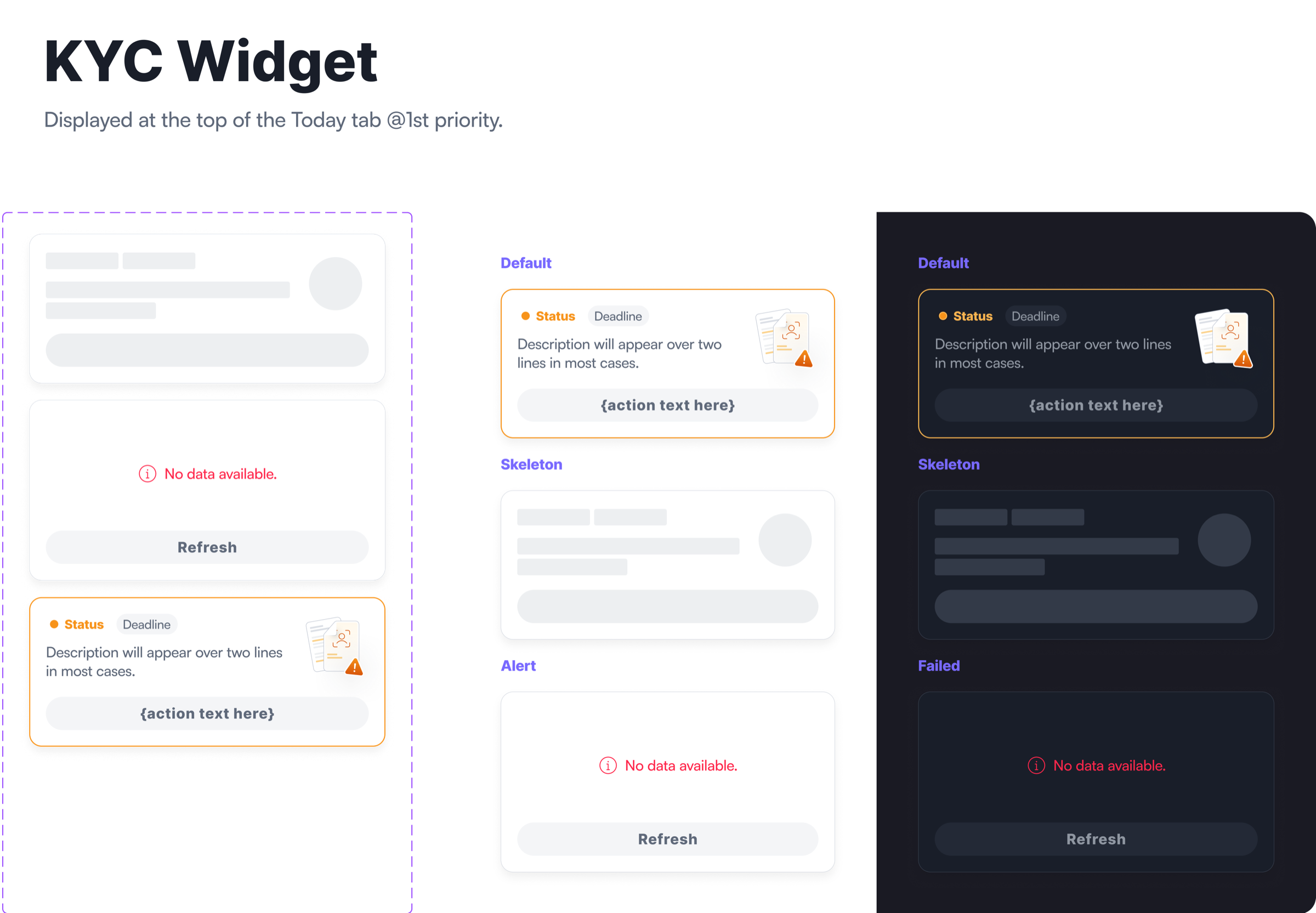
Compliance never stops: today it’s data renewal, tomorrow it’s a request for more information. Instead of a one-off prompt, I designed a KYC widget that can surface any regulatory request, so every future one has a home without a new build.

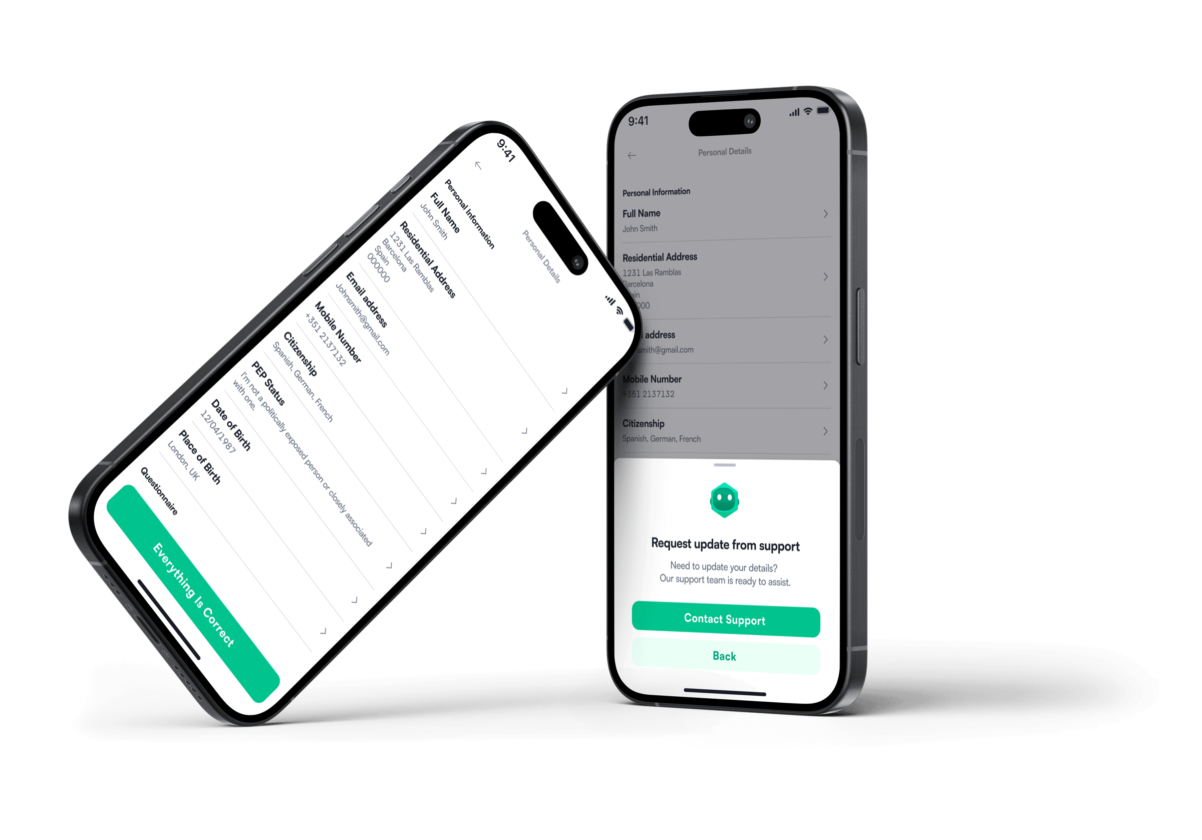
Confirming your data happens once a year, so why build a whole new section? The widget takes users to their existing profile page, they check their details, confirm, and they’re done.
The lasting result: even without data renewal, users can now change their name and address whenever they need to.
Over 700,000 users needed to confirm their data within a year. How do we avoid creating friction..🤔?
Why this is needed
SwissBorg had never asked users to reconfirm their data at scale in five years of operation. Regulations now required it and with hundreds of thousands of users on rolling annual cycles, the challenge wasn't just design. It was building something that could handle volume without breaking trust or flooding support.
Epic limitations
The users confirm the accuracy of their data themselves. It's up to the users to be honest with us and tell us their latest information, or to confirm that nothing has changed and everything is correct.

Manual review for all users would be impossible. Each Proof of Identity review costs money and would certainly lead to friction and drop-offs. So we don't want to make it mandatory to reverify identity.

Not everyone renews at once. Each user renews based on their onboarding anniversary.

After 30 days without confirmation, the entire app must be locked. The user can not continue unless they confirm.
A significant complication emerged mid-project. Onboarding questionnaire data wasn't stored in a reusable way, meaning renewal answers wouldn't persist correctly. Rather than patching it, we aligned as a team to build a proper questionnaire database unblocking data renewal and enabling a future tailored user journey epic at the same time. One fix, two problems solved.
A coincidental competitive observation
Researching compliance and regulatory features is not straightforward. Mobbin, Built for Mars, Dribbble none of them surface this kind of work. Compliance flows are sensitive, legally constrained, and rarely shared publicly. Companies do not post their KYC screens on design inspiration sites.
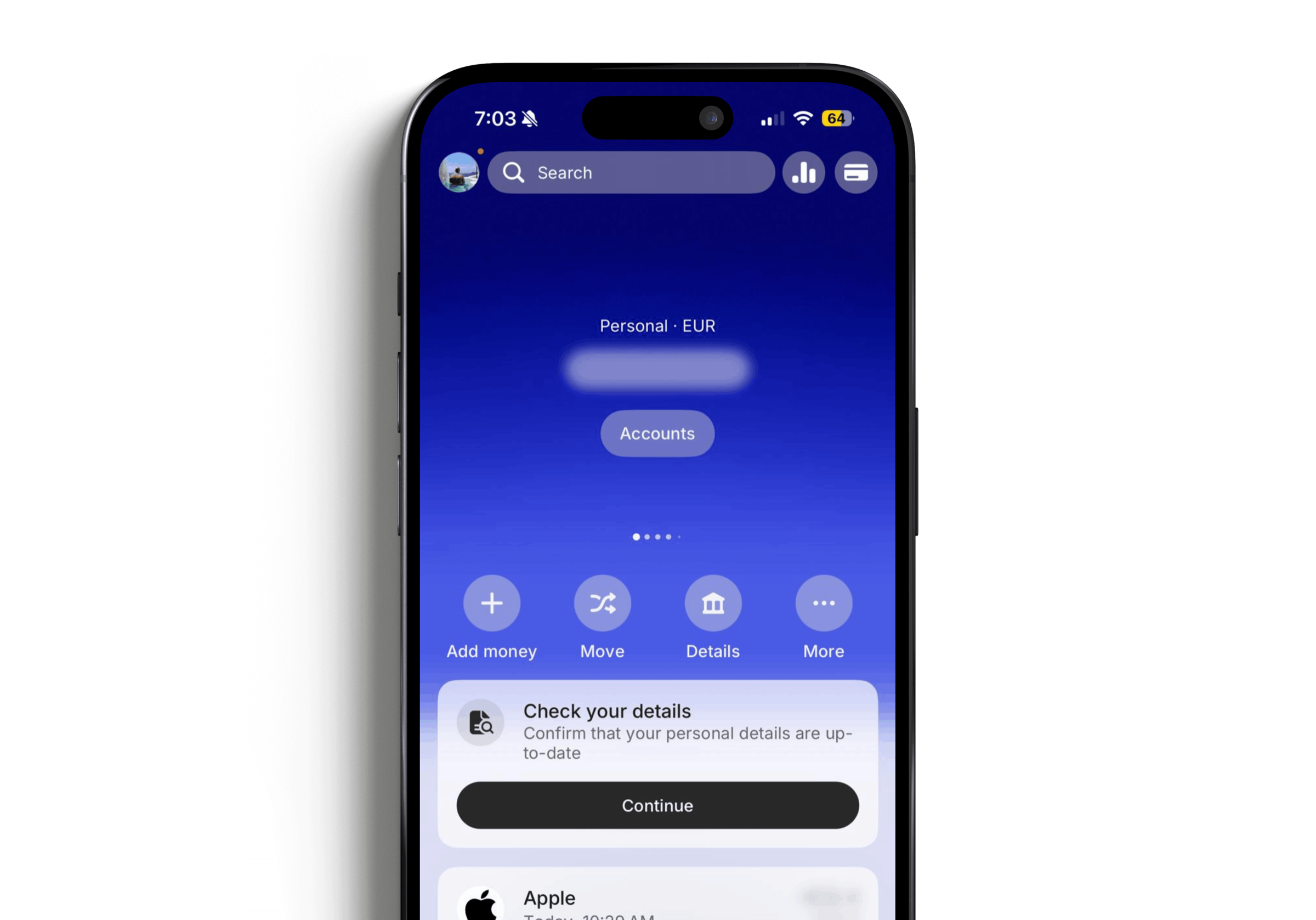
Around the same time I was designing the widget, I received a data renewal request from Revolut on my own account. They had gone down the same path I was planning a widget to grab user attention. Seeing it in the wild, on my own phone, as an actual user, was useful.
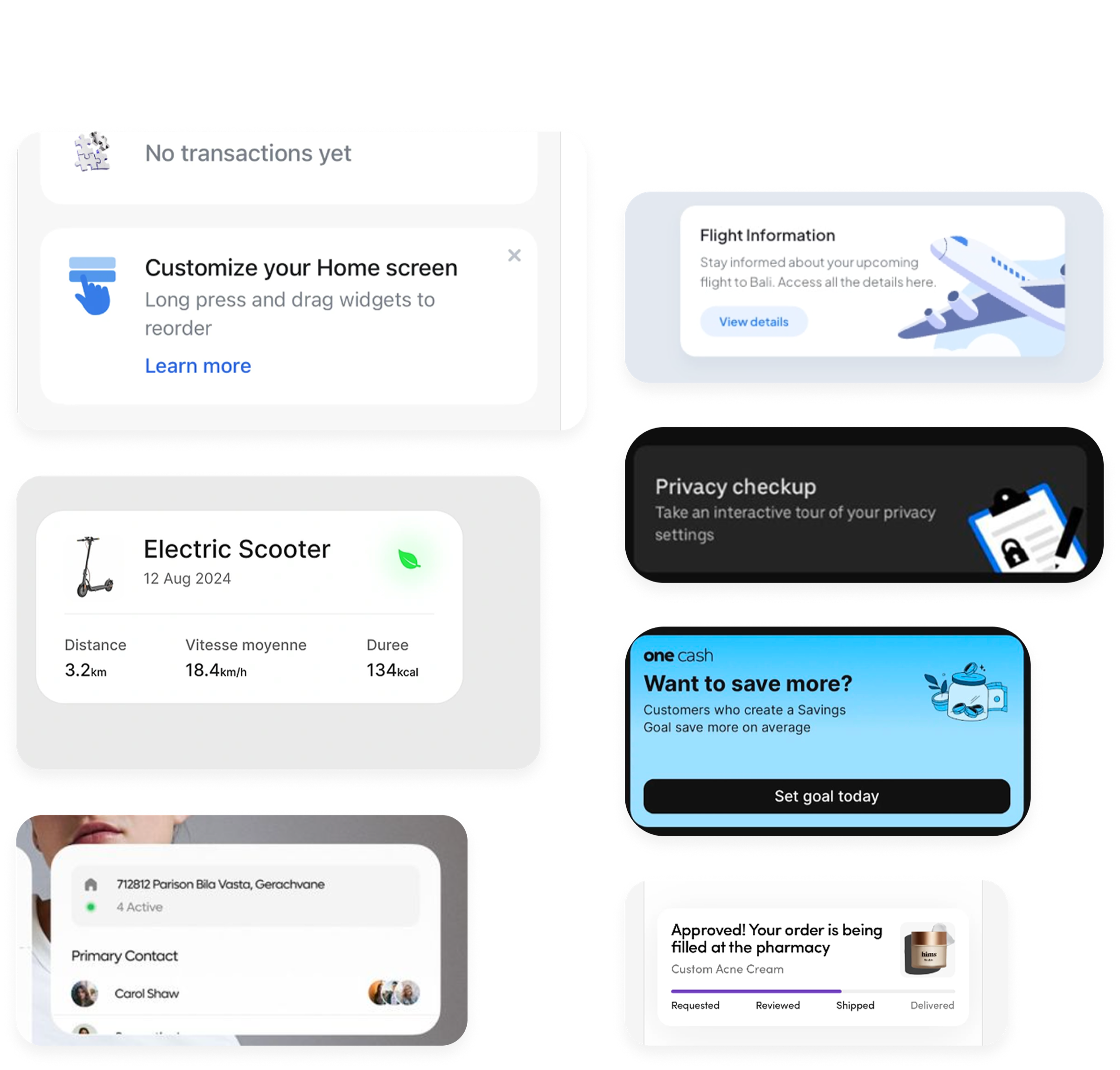
Using Mobbin, Dribbble, Pinterest and applications I tend to use I look into widgets. This widget in part had to do have 3 key features: 1. It had to have a “oh sh*t” I have to click this now type presence to it. As it was required by compliance for the users to complete this. 2. It had to provide context to the the compliance request we need users to fill out. 3. It had to be flexible and adaptable. This widget was going to be used not just once but would act as an entry point for all future compliance requests.
Iterations and ideas that were tested and either tweaked or removed entirely
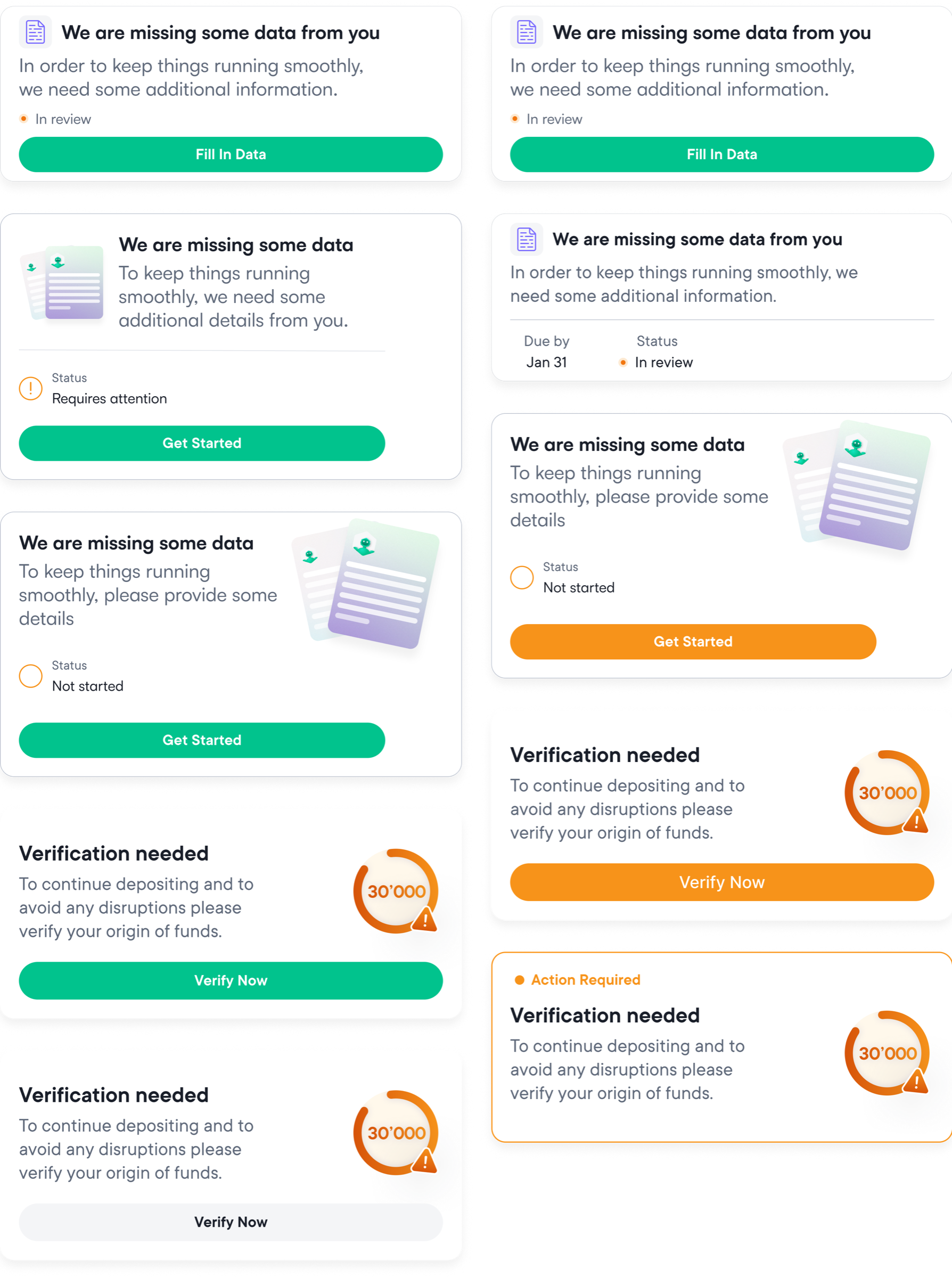
Throughout my widget exploration I kept on running to them same problem, it's not imminent enough. Using the primary green CTA didn't provide me that imminent feeling to it. When bringing it up to my team on the stand up, they felt the same. Nearing down to the bottom I started to see that it started to feel more energetic and have a warning presence to it.
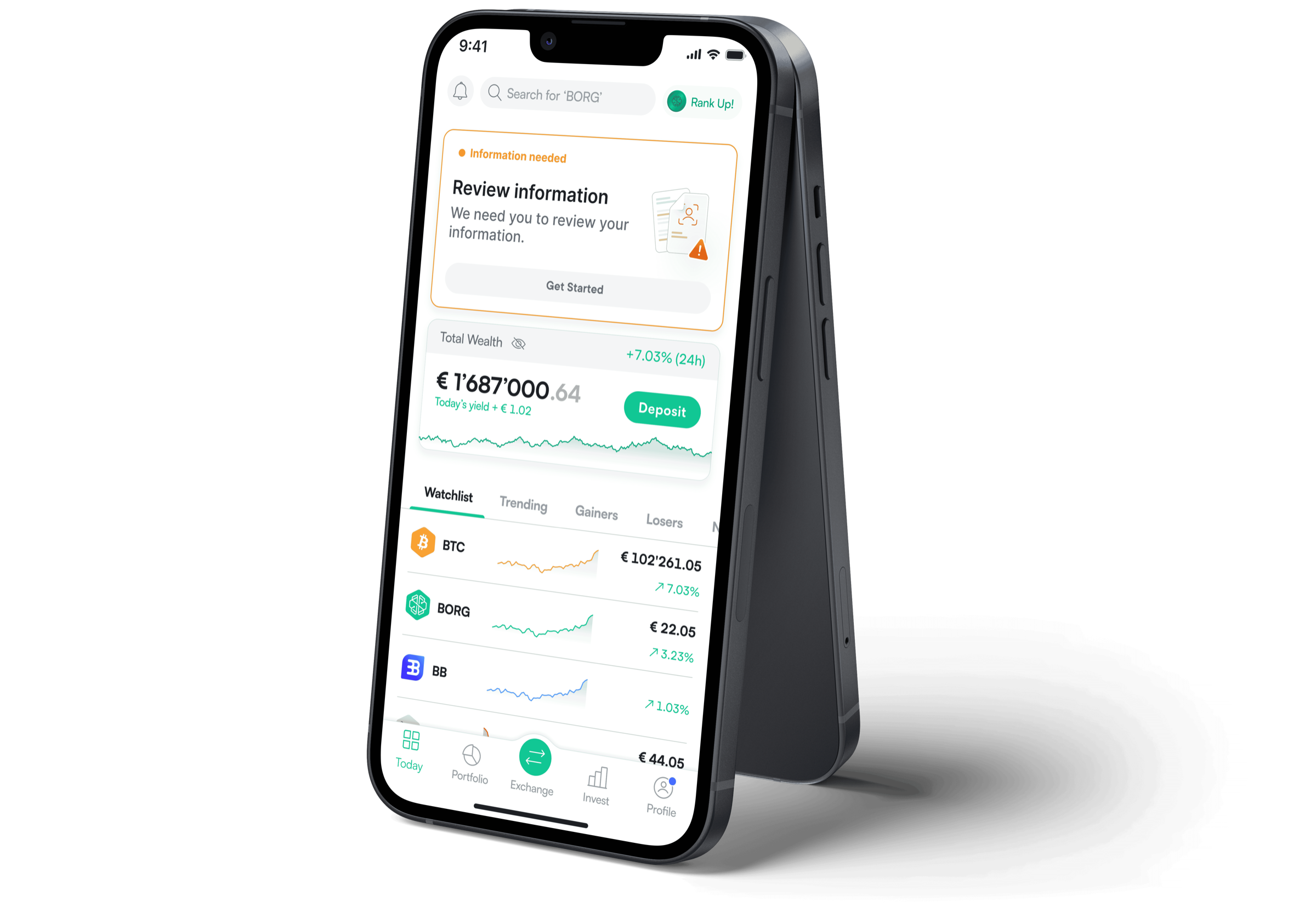
The original widget had a title. Simple enough. But when I started testing across different device resolutions the title would sometimes wrap to two or more lines depending on screen size. That created a problem with the shimmer loader state. It had no way of knowing whether the title would be one line or two, so when the widget loaded there was a slight bounce that pushed content below it down. It was subtle but it was wrong. Removing the title fixed it entirely and the sub copy alone gave users enough context without the bounce.
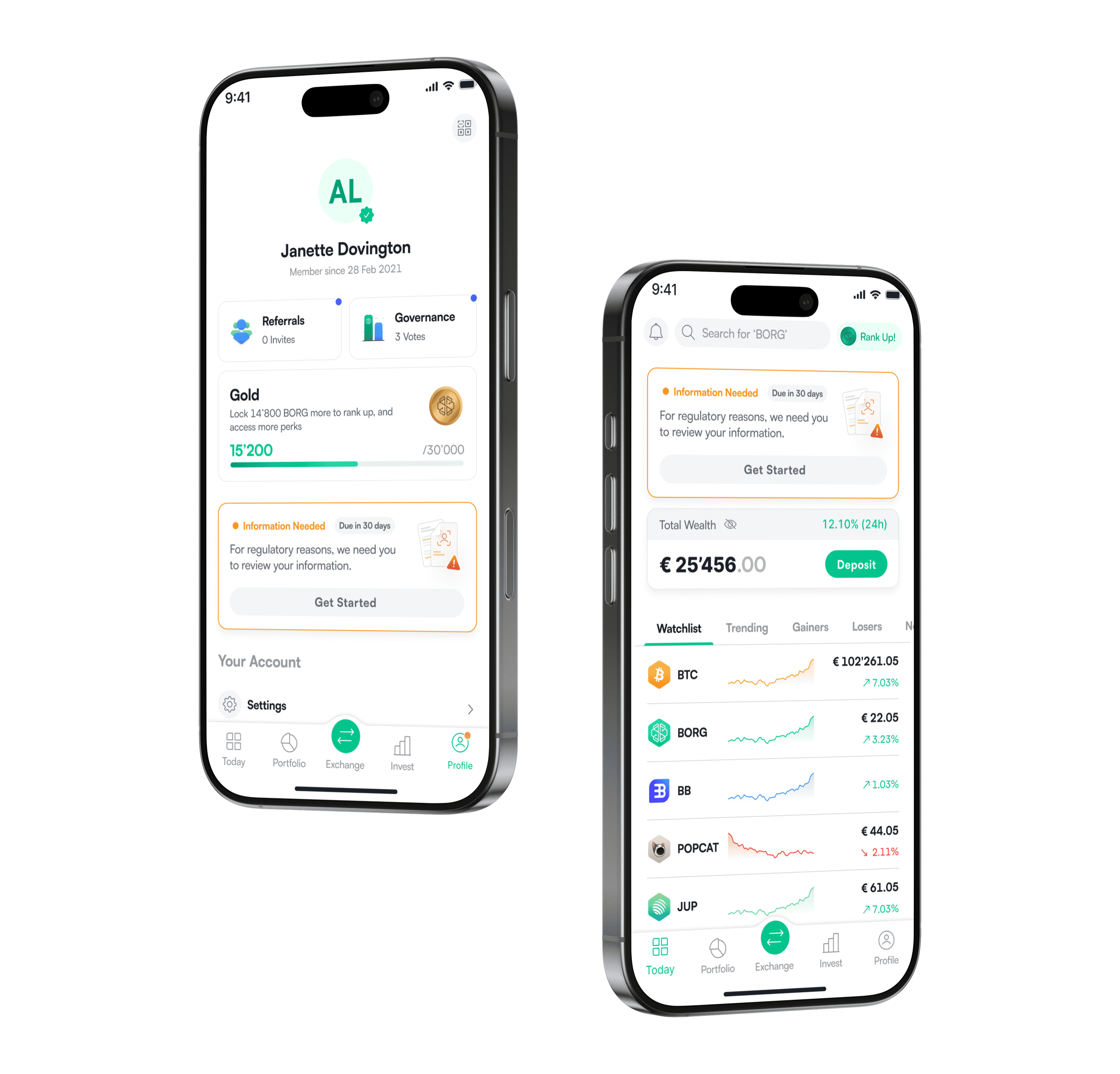
I also explored putting the widget in the profile tab instead of the main tab, with a pulsating notification dot on the profile icon that would not disappear until the user completed the compliance task. My thinking was that every squad fights for visibility on the main tab and I did not want to add to the noise. The app already used a lot of banners for new crypto releases and the KYC widget would have taken precedence over all of them until completion, meaning users might miss important updates. The profile idea felt cleaner. My plan was to A/B test it. A small cohort seeing the widget in the profile, another seeing it on the main tab, tracking conversion through Metabase. If the profile performed near or better I would do a full 50/50 split.
Two things killed the profile idea. First, I spoke to a designer from another squad who was also pushing widgets to the profile tab for loyalty features. When I placed mine alongside hers it was a wall of bento widgets. It felt cluttered and overwhelming. Second and more importantly, it came down to impact. We needed users to complete this as fast as possible with as little friction as possible. Compliance requests are never fun. Hiding something that serious on the last tab behind a small notification dot felt wrong. If it matters, show it. Do not make users hunt for it.
The backend conflict
There was no backend database for the onboarding questionnaire. That sounds like a technical detail but it was actually a significant UX problem. When users onboard at SwissBorg they complete a questionnaire. Most of it is compliance. The answers determine risk profile, trigger document requirements in the back office, and flag anomalies. A user earning 25k but holding over 100k is a red flag. The questionnaire is how we know. The problem was that without a backend database, if a user wanted to update their questionnaire answers during data renewal, we had no way to show them their existing values. They would see empty fields with no idea what they had previously answered or whether anything even needed changing. It was a horrible experience waiting to happen. I pushed hard for a backend database. My PM and I took it to the engineering lead and we spent hours going back and forth on it. Eventually we aligned. We would prioritise building the database. But we also needed a contingency. If the database was not ready by the release date, users who needed to update questionnaire answers would be directed to support instead. I brought in the support team early to make sure they were briefed and prepared. In the end the database was delivered and the contingency was never needed. But having it meant we could ship confidently without leaving users exposed.
Every decision had a reason
The key decisions that shaped a flow used by 220,000+ users.
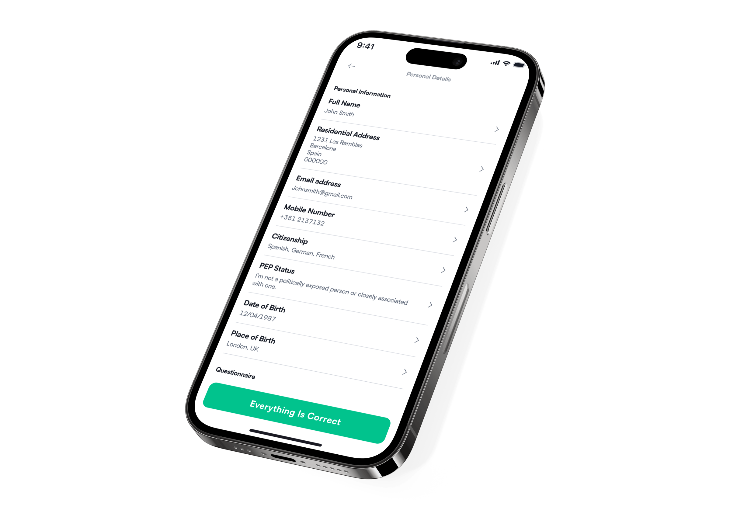
The most important design decision wasn't a new screen, it was simply not building one. The profile page already contained everything users needed to review. By adding a single confirm button rather than designing a new flow, we removed engineering overhead, kept the experience familiar, and covered the happy path for the majority of users with minimal friction.
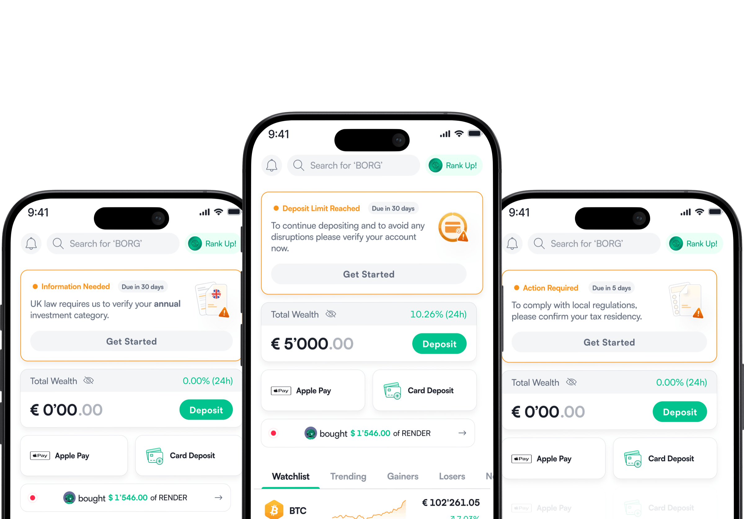
A shared KYC widget with a consistent surface that could surface any regulatory request without a new build each time. It went on to be reused for UK compliance, Proof of Residence, Proof of Identity, Tax ID, and many more.
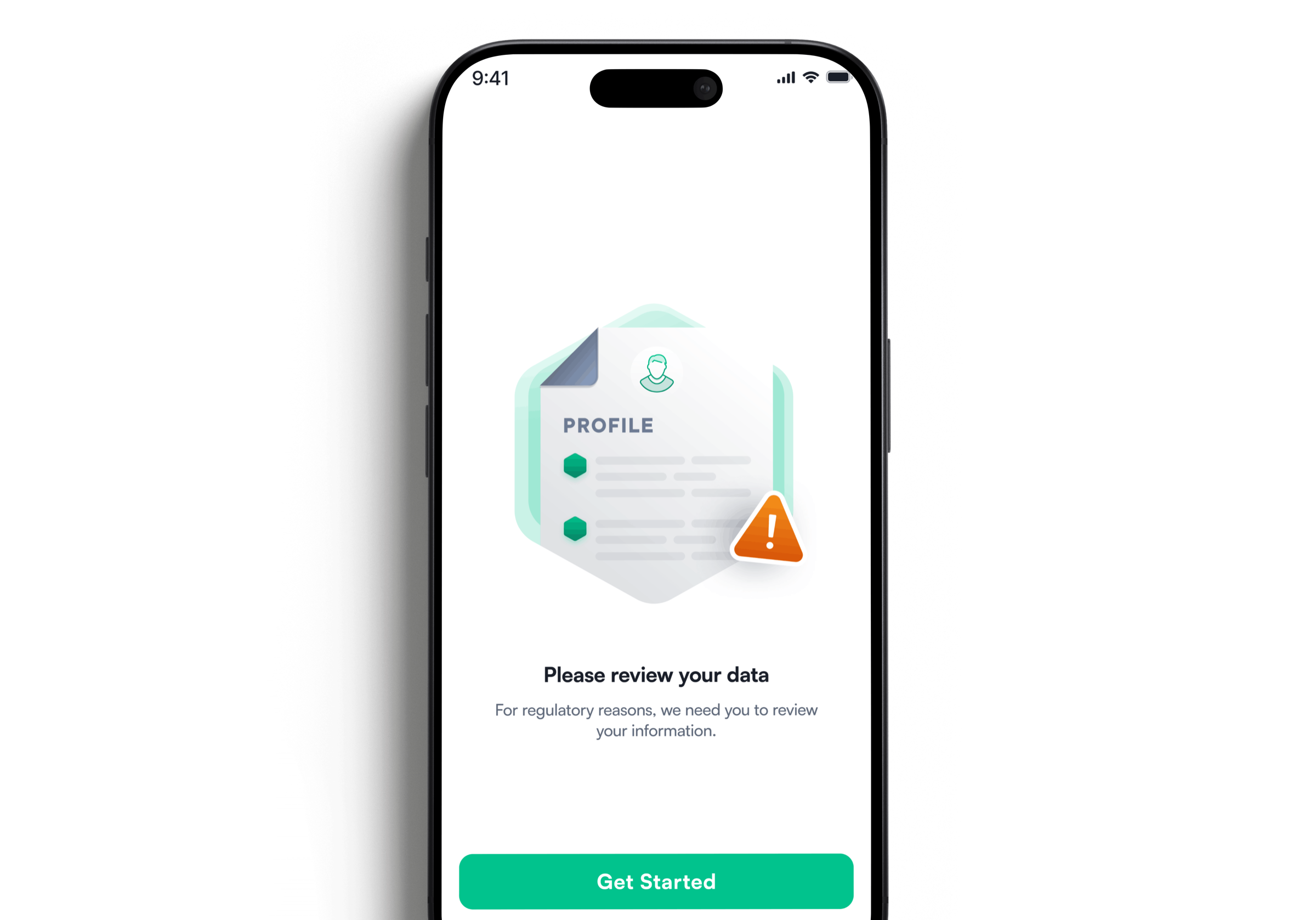
A previous compliance epic had tried blocking trading and deposits while allowing app access. Users pushed back hard. A/B testing on this project confirmed that a full app block after 30 days drove significantly better completion with less complaints a clear stop is easier to understand than a partial one.
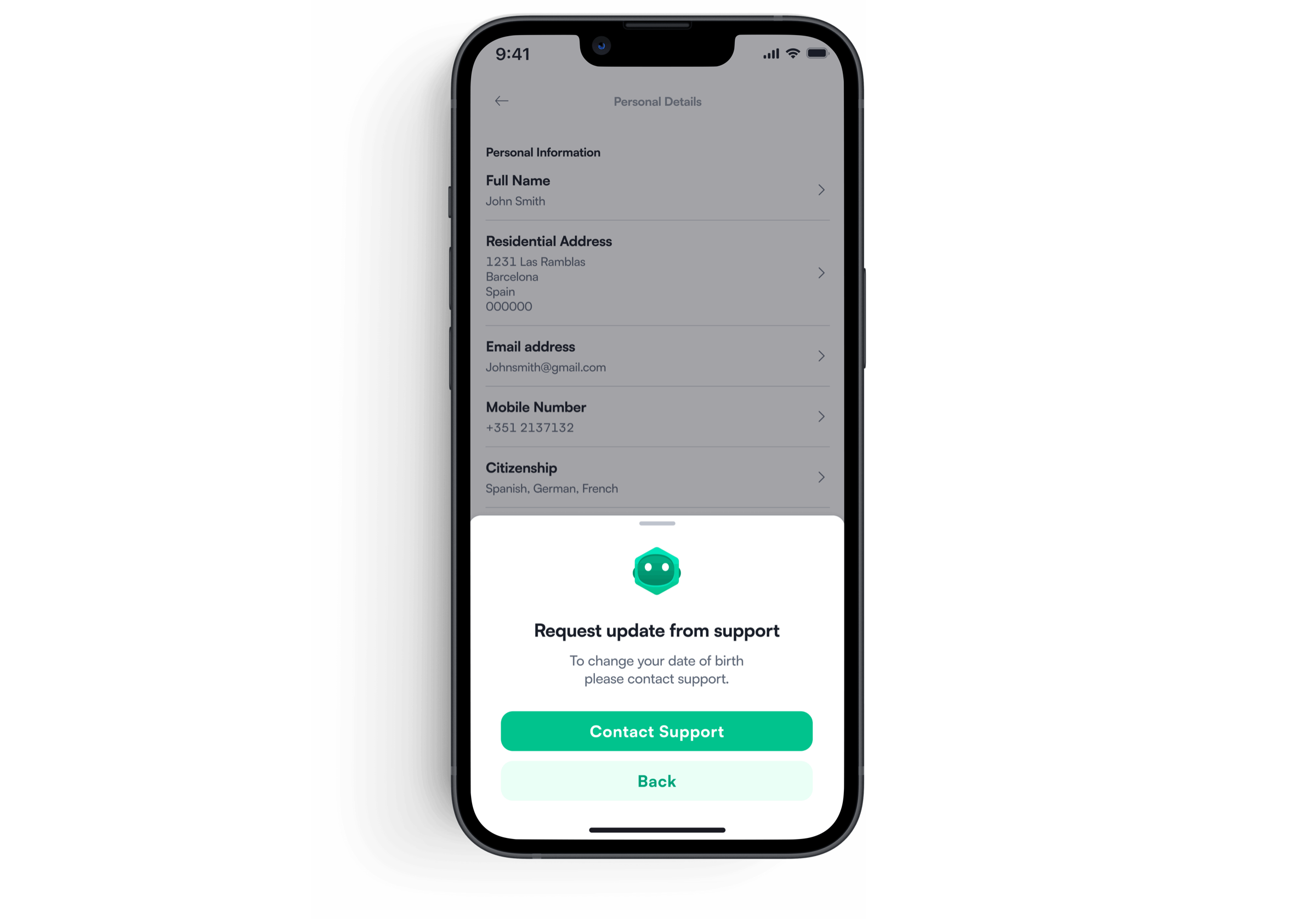
I initially proposed locking these fields after a successful Proof of Identity to protect verified data. Legal required all users to retain the ability to edit personal details. We aligned with support to route these sensitive changes through support review staying compliant while reducing misuse risk.
A new powerful and flexible component in the design system
Updating the design system Once the component was created I added it the design system with the various states and different theme modes. Error state, loading state and its default state. Provided documentation. Once completed I spoke with the design system manager to double check everything was good.
Epic planned in phases
The priority was getting a compliant confirmation flow live first covering the estimated 65% of users who simply needed to confirm nothing had changed. Update flows for name, address, citizenship, and other fields followed. This phased approach meant that even if timelines slipped, users could be directed to support as a fallback rather than leaving the platform exposed to fines. The backend complication added time, but the team delivered. Support had been briefed on the contingency plan and were prepared. in the end it wasn't needed.
Handing off the designs for development
Design hand off was simple and efficient. I aligned with my frontend engineers and my line manager, as well as the design manager, to make sure that all new components are well documented. Below is a photo of the hand-off. During the entire development I kept close contact with my Product Manager and Engineers always ready to make any iterations or answer any questions.
From start to success without any edge cases or updating information.
Users are now able to update their name by carrying out proof of identity without needing to go through customer support.
Updating Proof of Residence without needing to contact support unless the country is not supported.
Users who are a PEP (politically exposed person) are not allowed to continue on the app and if they state they are a PEP they need to contact support.
My thoughts on this project
This project was more complex than it appeared. What looked like a straightforward confirmation flow involved legal constraints, backend blockers, a reusable widget system, and decisions that affected hundreds of thousands of users. The biggest lesson was that the best design decision was one that avoided design altogether reusing what already existed rather than building something new. It was faster to ship, familiar to users, and required no additional engineering for the majority of cases. The KYC widget is the part I'm most proud of. It turned a one-time compliance requirement into a long-term system that made every future regulatory request cheaper, faster, and more consistent to deliver.