Overview
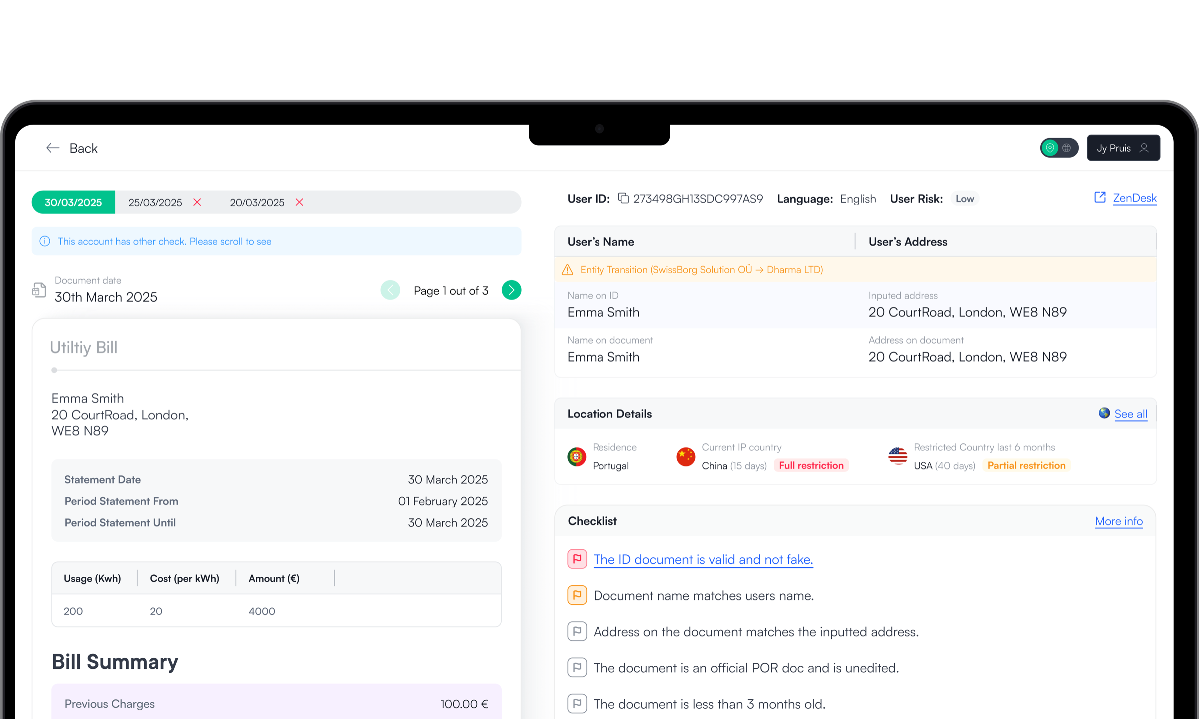
SwissBorg compliance agents were reviewing Proof of Residence applications through a fragmented, tab-heavy back office with no defined process. I redesigned it into a guided, single-screen review flow, cutting handling time and standardising decisions across all agents.
The Problem
Unrelated information cluttered the screen, forcing agents to mentally filter what mattered for each review.

Agents jumped between multiple tabs to review a single application, losing context and wasting time with every switch.

Every agent decided their own check sequence, creating inconsistency across the team and slowing decisions.
There was nothing to tell agents what a passing check looked like or reassure them their decision was correct.
The Goal
Turn a slow, fragmented review flow into a clear, and intuitive guided process that helps agents decide faster and more consistently.
The Solution
A guided, single-screen review flow that presents all required information in one place, in a structured sequence — so agents never have to decide what to check next.
A fixed review order removes ambiguity and ensures every agent follows the same process.
Yellow to proceed with awareness. Red flags on critical checks disable approval automatically.
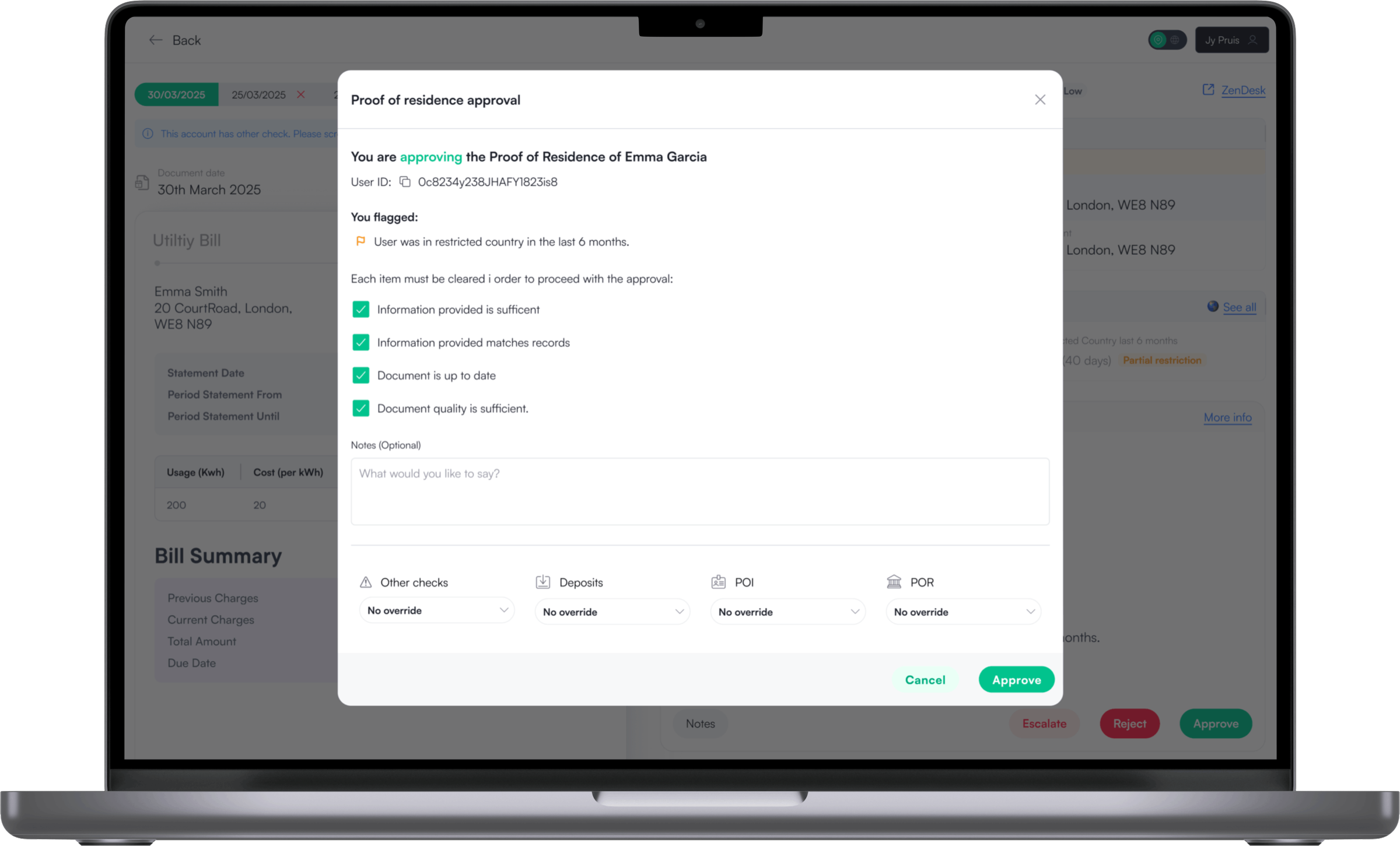
Approve, escalate, and reject modals pre-populate with flagged reasons and notes. Saving time and reasoning.

A legal requirement, yet painful to use. How can we make our agent's life easier without compromising compliance 🚨 ..?
Regulation
Governments require crypto platforms to verify Proof of Residence for users holding more than €5k AUM. At SwissBorg, this was handled through document uploads reviewed by internal compliance agents. The process was mandatory, high-risk, and time-sensitive. Yet the tooling supporting agents had evolved organically over time and wasn’t designed around how agents actually worked day to day.
Epic limitations

Agents needed access to a large amount of specific user data to decide whether to approve, escalate, or reject a Proof of Residence application. All information had to be visible, auditable, and defensible.

Our Backend engineers were fully blocked on other initiatives. The redesign had to be delivered without backend changes, working closely with a single website developer to get the most out of existing data and design.

Agents needed to make decisions quickly. Excessive scrolling or tab switching slowed reviews and increased errors. The goal was to present all critical information in a single glanceable view.

Compliance teams experienced frequent rotation. The system needed to be immediately understandable for both new and experienced agents, without relying on tribal knowledge.

If successful, this review pattern needed to be reusable for KYC1 and KYC3 with minimal changes.

This was an internal system, so the solution needed to be lightweight and efficient to build.
Seeing how agents interact with the back-office
I shadowed agents across different experience levels and spent time reviewing applications myself in the test environment. The friction was immediate. There was no clear starting point, no guidance on check order, and no reassurance that a decision was correct. Every action felt uncertain.
From this, every design decision that followed was guided by one principle: Optimise for decision making, not navigation
Rapid prototyping
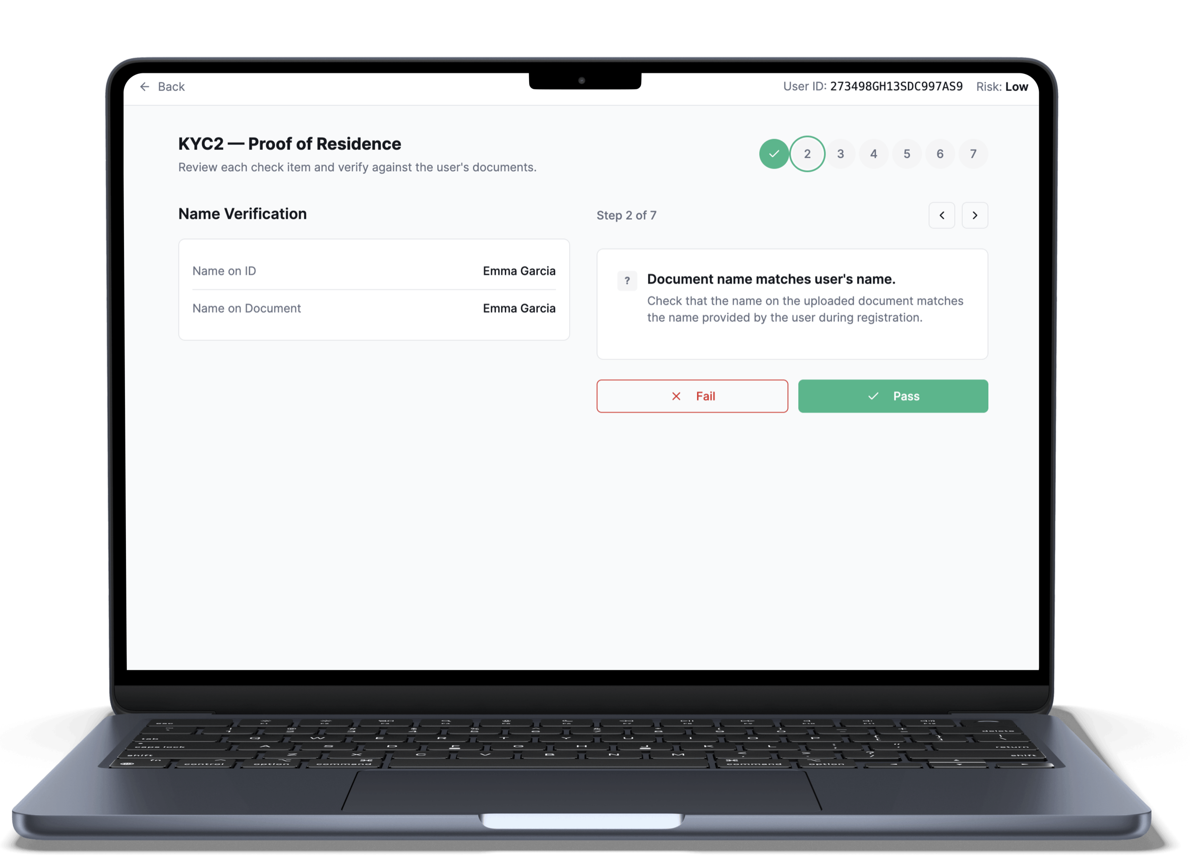
I built and tested a linear prototype in Lovable to explore whether guiding agents through one check at a time would reduce cognitive load and improve decision quality. The concept removed the multi-check overview and focused on a sequential flow for reviewing Proof of Residence applications. While the structure felt clearer in theory, testing revealed it: - Required 12 additional clicks. - Increased review time by roughly 60% compared to the existing format. The loss of overview and flexibility outweighed the benefits of linear guidance, so the approach was not adopted.
A system that relied on tabs, long pages and agent's memory
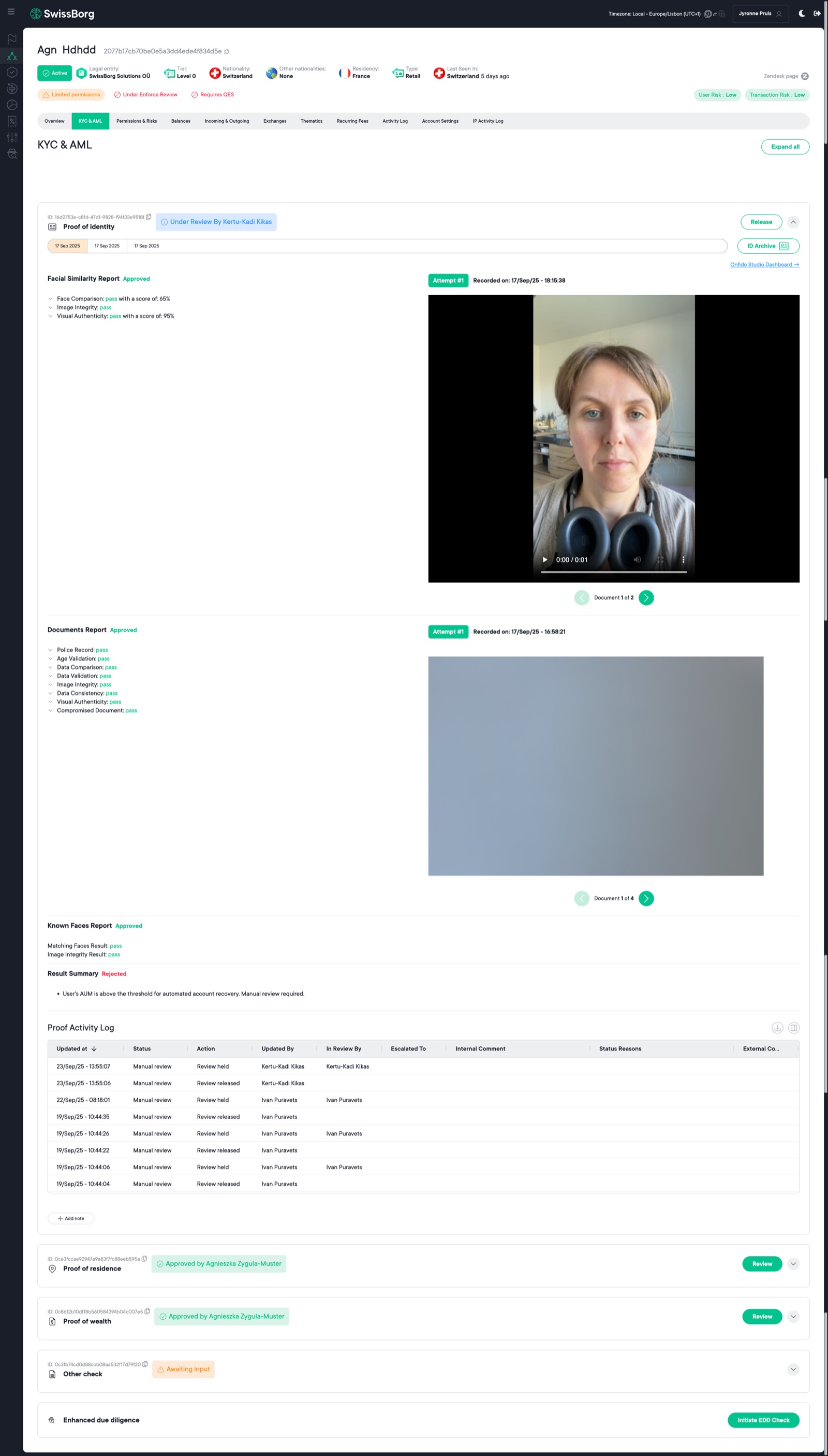
Unfortunately, I no longer have access to the back-office. However, the screenshot below shows how the system previously worked. The interface was extremely long and relied heavily on tabs to separate information into different sections. This required excessive scrolling and constant context switching. Even though agents reviewed one application type at a time (Proof of Identity, Proof of Residence, or Proof of Wealth), they were still exposed to a large amount of unrelated information. With no clear review order, agents had to decide for themselves what to check next, increasing handling time and slowing down decisions.
My own experience with the back-office
To fully understand the workflow, I spent some time acting as a compliance agent; reviewing, approving, escalating, and rejecting Proof of Residence applications in the test back office. This surfaced confusion. My first thought was: where do I start, and what should I look at first?
I was looking at a Proof of Residence check but I also have to use their Proof of Identity check so I have to go scroll up and down open and close tabs. it was a mess.
To me, the back-office was like the Wild West. I was doing what I wanted with no clear instructions what to check, what can pass, what can't pass and ultimately I was figuring this out alone.
I could complete the checks, but the system didn’t guide or reassure me that the decision was correct, making every approval, escalation, or rejection feel uncertain.

Agents weren’t slow because the work was complex. They were slow because the system made them manage the process themselves
Key considerations
From my research I sat down with my Product Manager and set the scope. Here Design decisions were driven by one core principle, optimise for decision-making not navigation
(this was for KYC 3)
Why designs were produced certain way
Looking into key design aspects of the solution and why they were designed in a specific way.
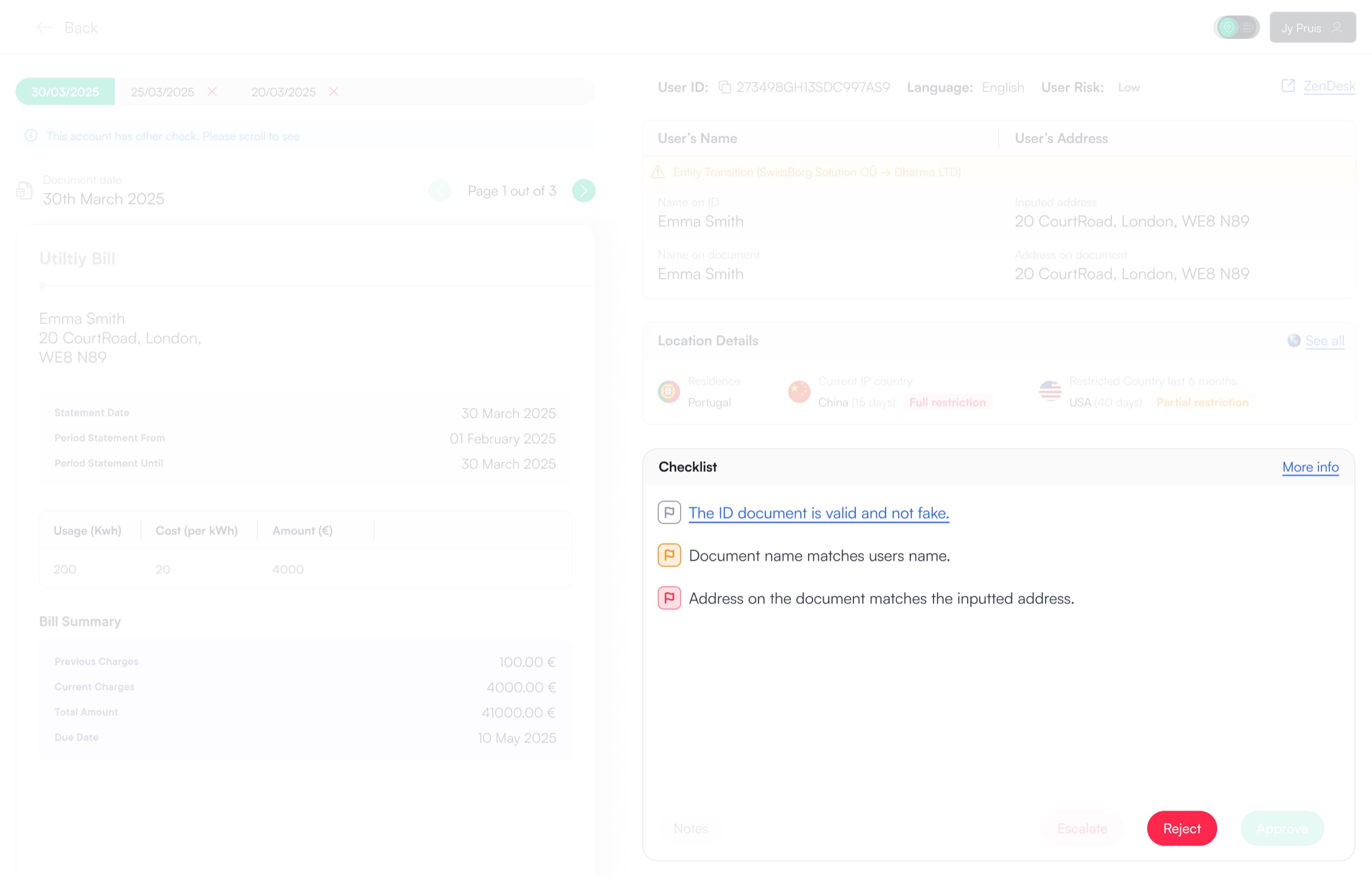
Agents are quickly able to flag issues. If the flag is yellow agents are able to escalate or approve. However, if one flag is red escalate and approve CTA's are disabled and the agent can only reject. Some flags require two clicks to turn red and some checks like "Address on the document matched the inputted address" would turn red directly as that is a huge compliance security risk if the agent accepts the user and the data is not consistent.
Click on the flag to go through the different states.
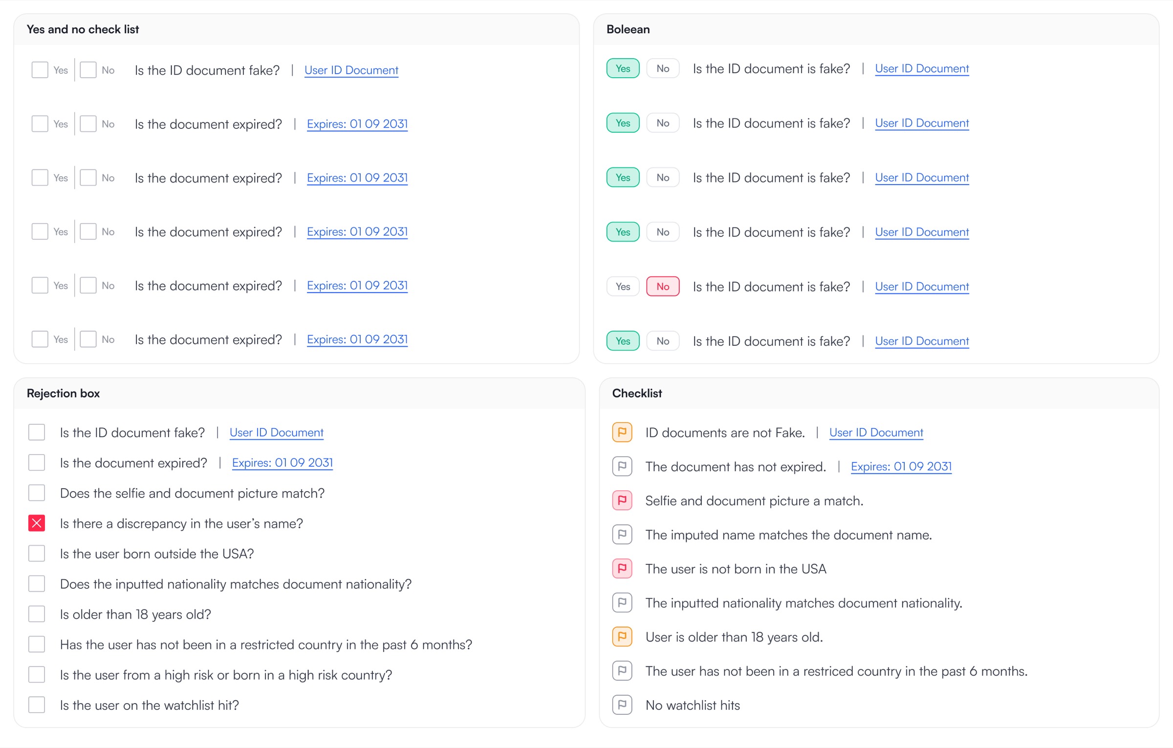
I looked into multiple options and landed on flagging. The reason is because in all the other options (there was more than just the ones shown here) They are all a sort of boolean options true false, yes and no. There were multiple reasons why I did not agree with this. firstly, I wanted the agent to click as little as possible in order to approve a user and the other is that even if something is false or something to keep an eye on, it doesn't classify as a application rejection and having a boolean doesn't have that level of flexibility. Agents also agreed that they preferred the flag-based approach over the others due to the flexibility.
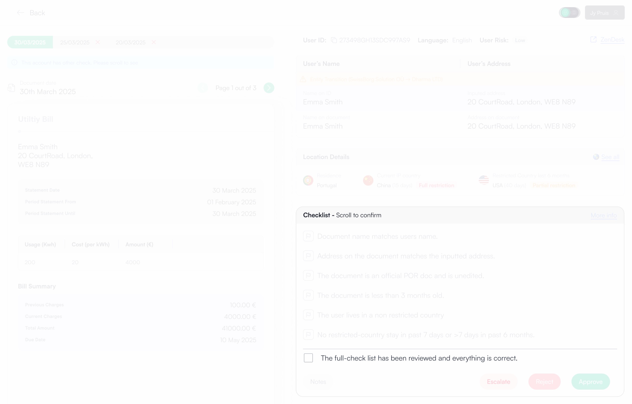
If the agent has a smaller screen resolution the checklist overflows and becomes scrollable. However at the very bottom there is a check the agents must click in order to approve the application as it's compliance for the agents to carry out all the checks. Once the check is checked the approve button will be enabled and the agent can approve the user's application.
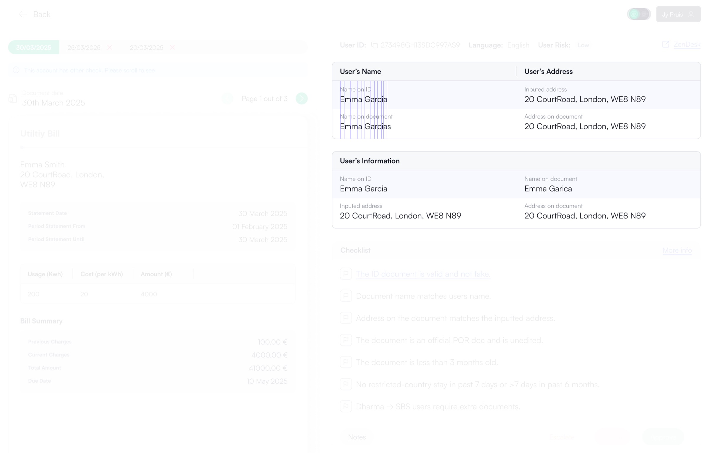
Previously to compare, the agent would have to scroll up see Proof of Identity remember or duplicate tab and then compare it to the information of Proof of Residence. Not a very efficient process. In the new back-office update the agents have all the information is a stacked view so that they can clearly see if there is a mistake in the documents or not. As you can see in the image above it's much easier to see there's an inconsistency in a stacked view vs side by side view.
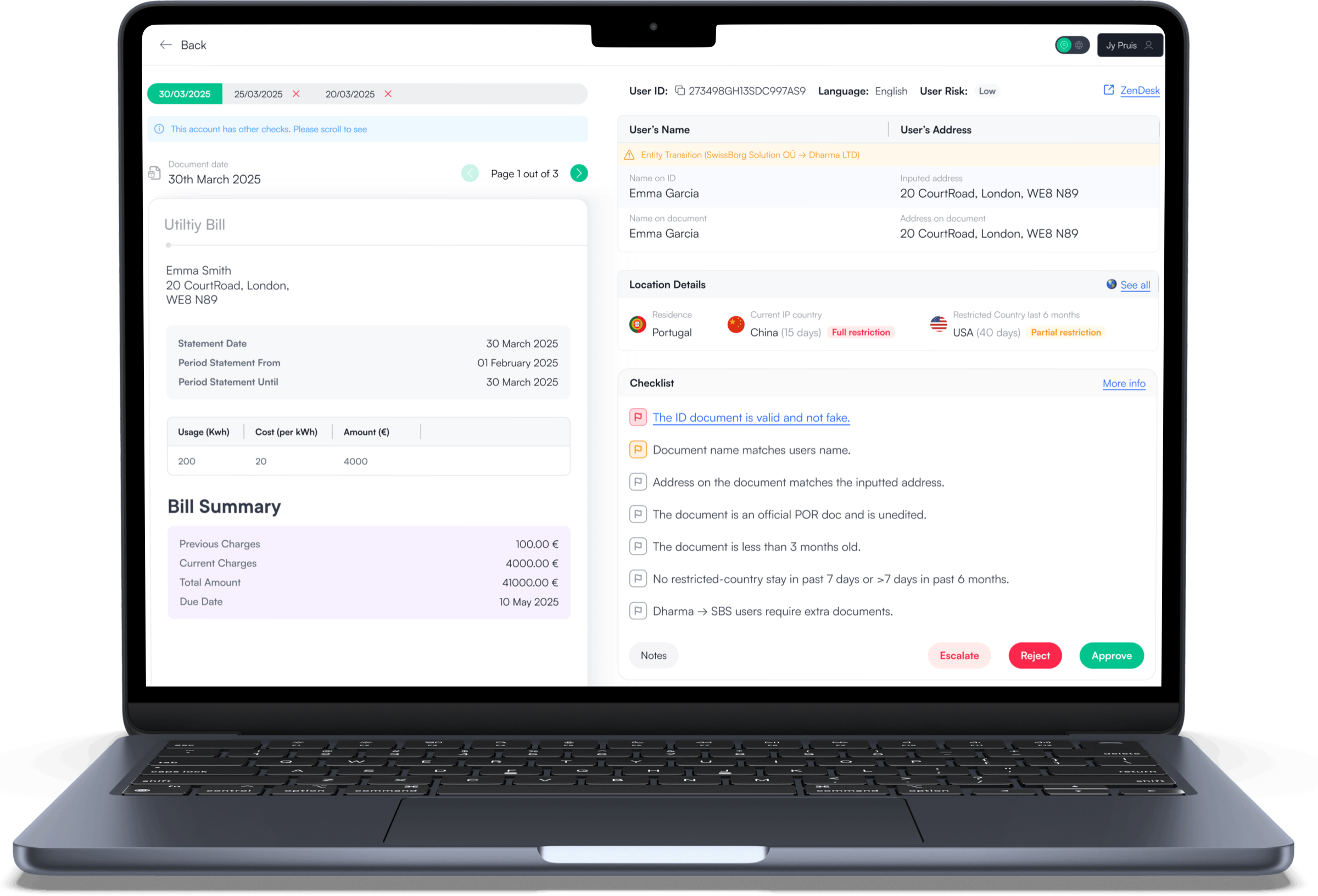
Everything an agent needs in one screen.
From all the research conducted looking at the agent's needs and pain points, this was the proposed design solution that saved the business and agents huge amount of hours work per week in the first week alone.
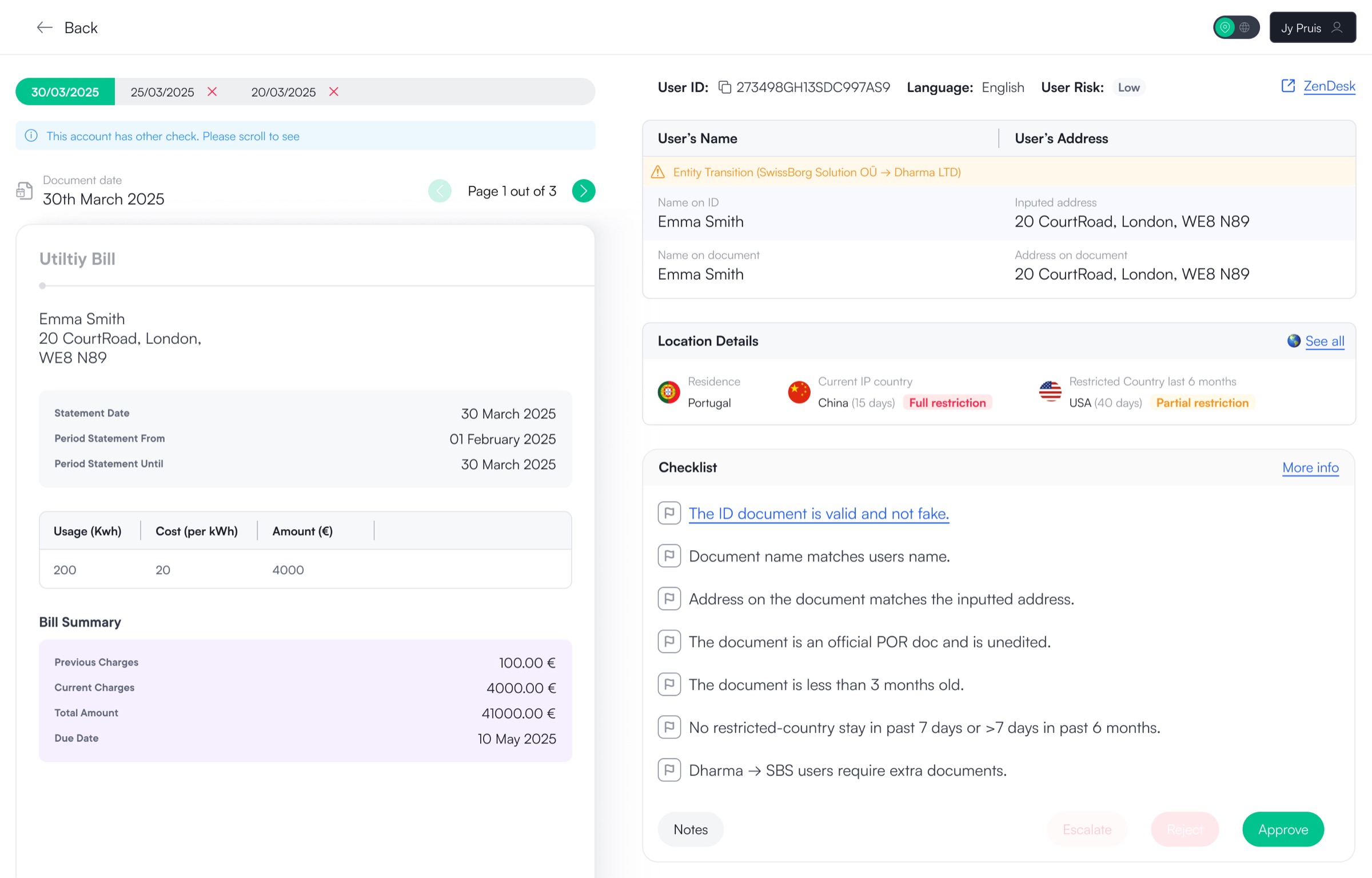
The full design of the proof of residence with all the checks and information needed.
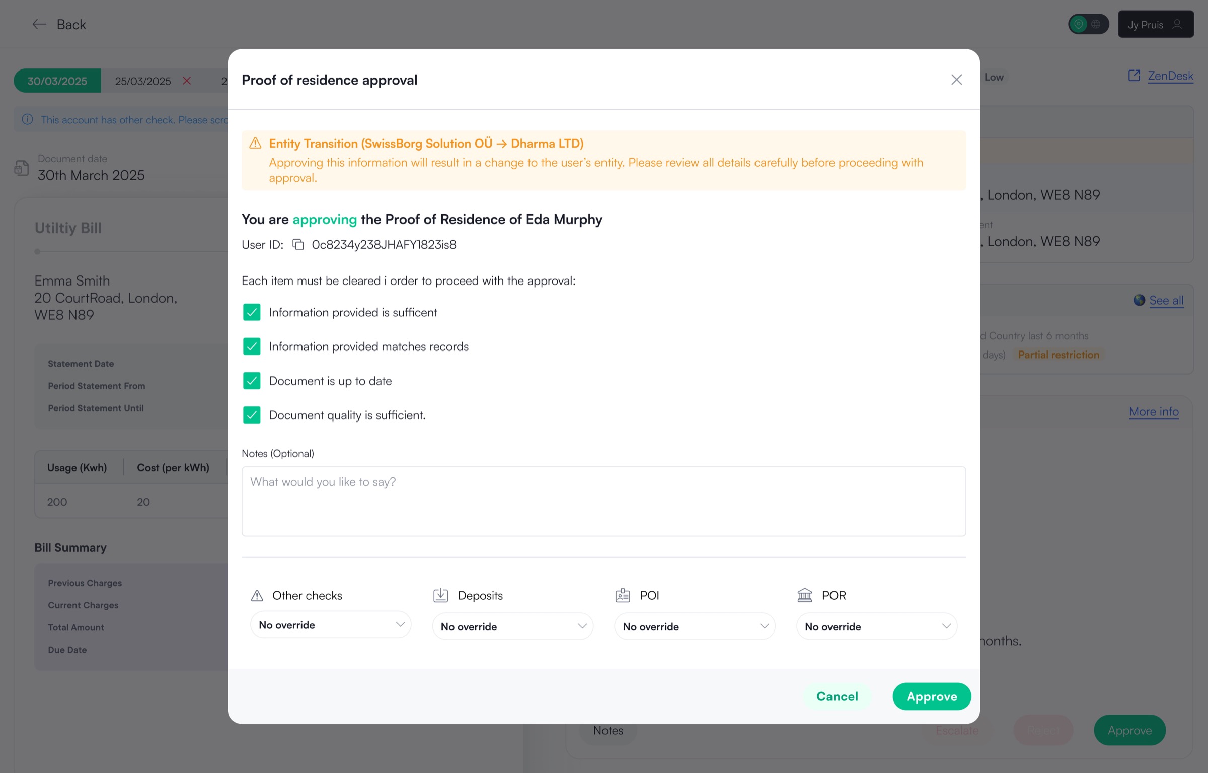
Here the user is able to approve the application as well as set any limits to the user or leave any notes for future reference.
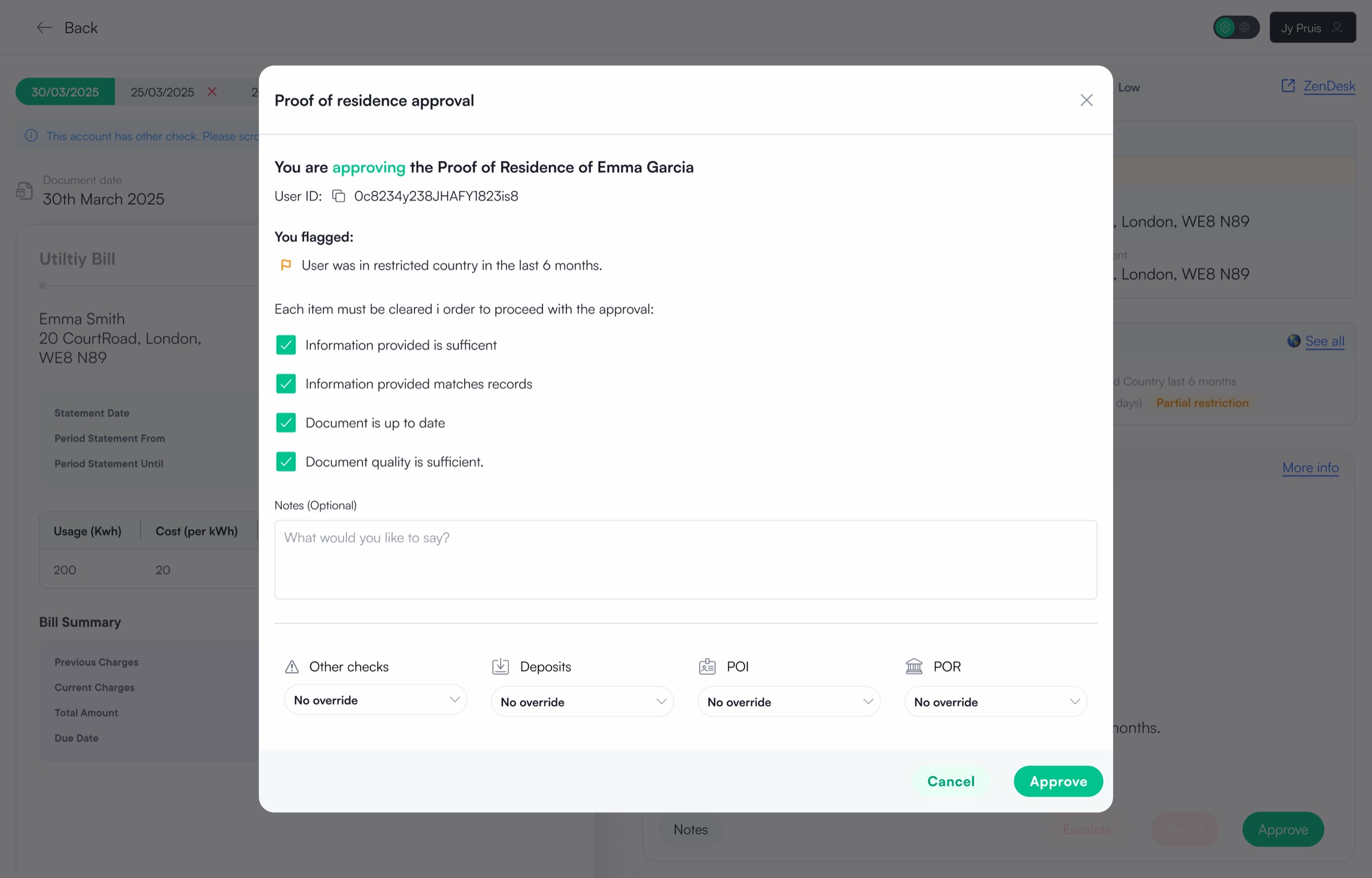
Not every application is as simple as following the checklist. If the agent sees the user has been in a restricted country in the last 6 months that's not a cause to reject but they can flag so other agents know they are aware of this and keep a closer eye on the user.
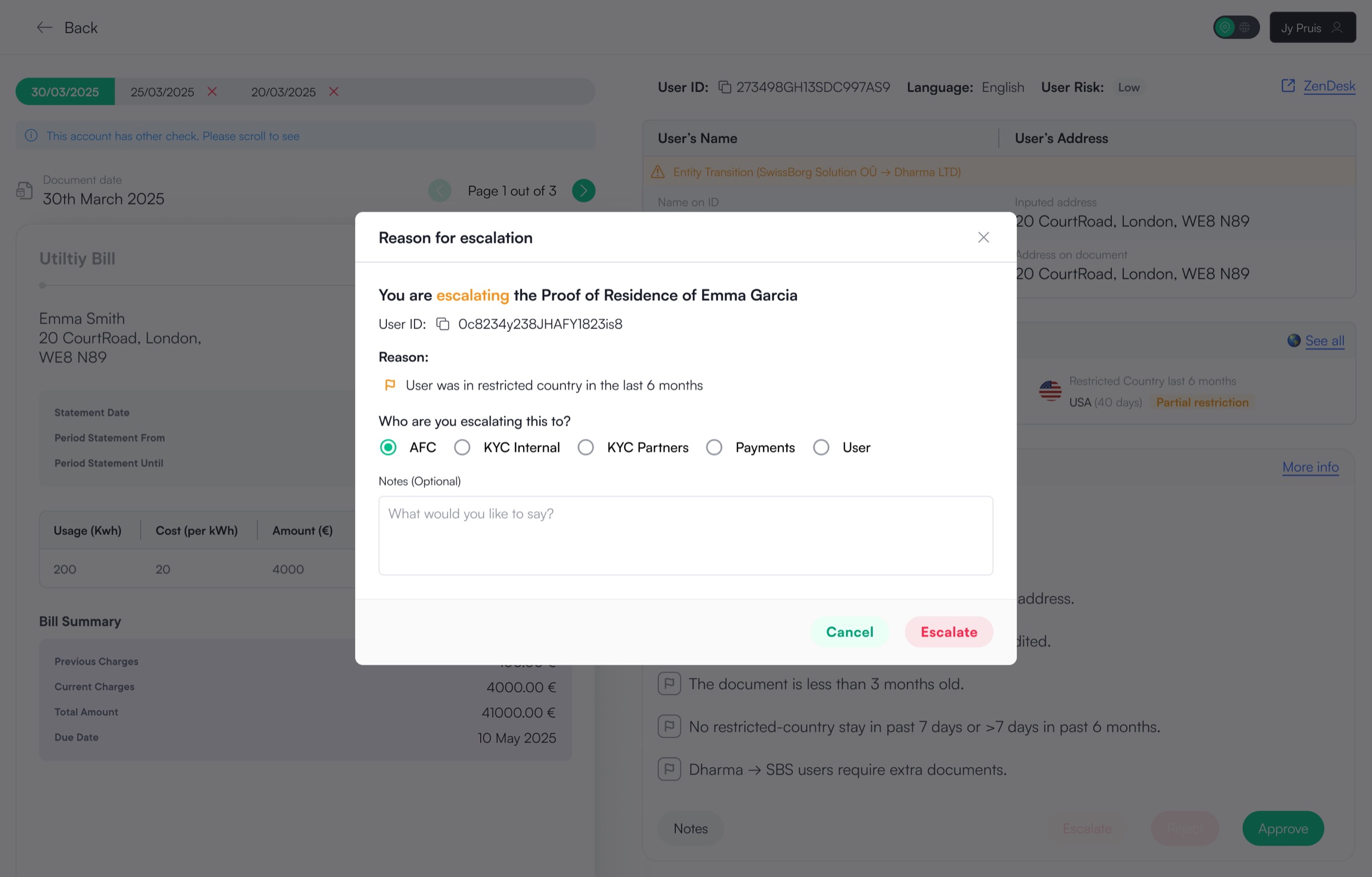
Here the user is able to escalate the application with reason flagged being shown on the modal. This does not mean the application is rejected but rather the agent might need a second opinion or is not comfortable to make the decision alone.
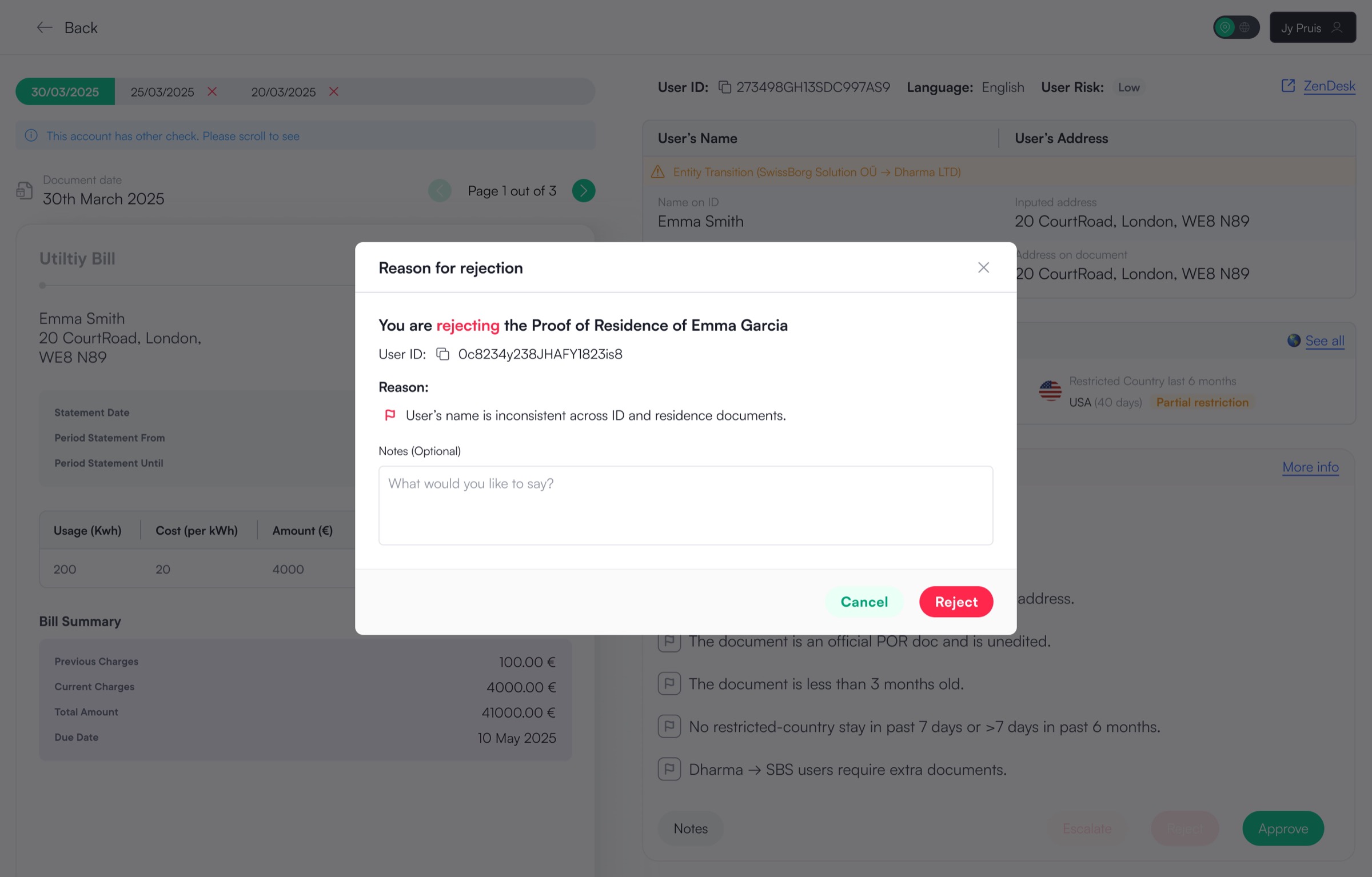
Here the user is able to reject the application with reason flagged being shown on the modal. The agent can then add any notes extra they want to keep for reference.
Seeing if the template works on other Proof checks
As mentioned above the Proof of Residence design would act as a template to other checks. Designs for Proof of Identity and Proof of Wealth were also done before locking in the final template style for Proof of Residence to see if works for other checks.
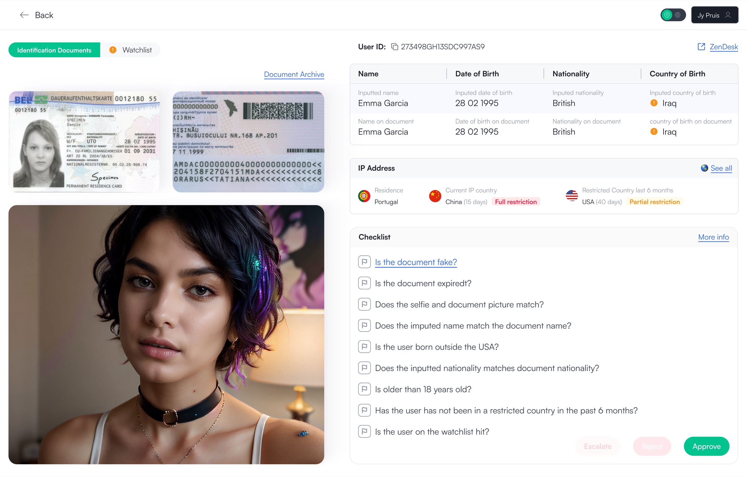
Proof of Identity is the first application the user has to do before being able to invest at SwissBorg. Here the user uploads of a photo of one of their government documents and a face scan. If the image is too small or does not show the all the information the agent can click to open in a lightbox to view the entire image in full.
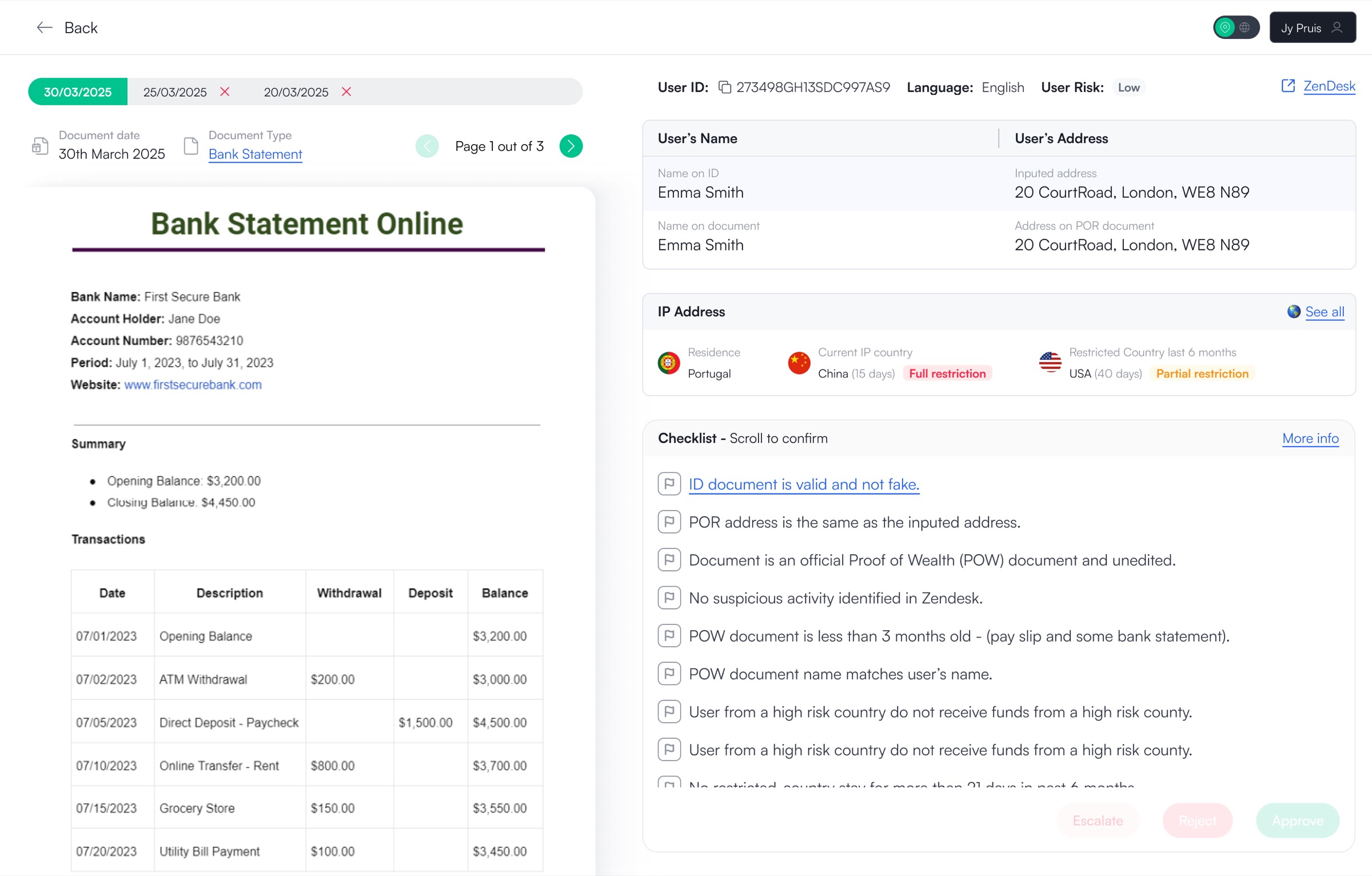
Proof of Wealth is the last and final application the user has to do once they reach 50'000 AUM in their portfolio they can not carry on investing until they provide their proof of funds. Here the user uploads a document stating their funds, this can be a pay slip, bank statement, inheritance information etc.
The hard truth, Did the agents actually like this solution?
They loved it but some longer-tenured agents, used to their own workflows, pushed back and wanted access to the legacy back office. Rather than forcing the change, we introduced a temporary "More info" link to the legacy system alongside the new experience. After one month it was removed. The transition was gradual, resistance was minimal, and the new flow became the default.
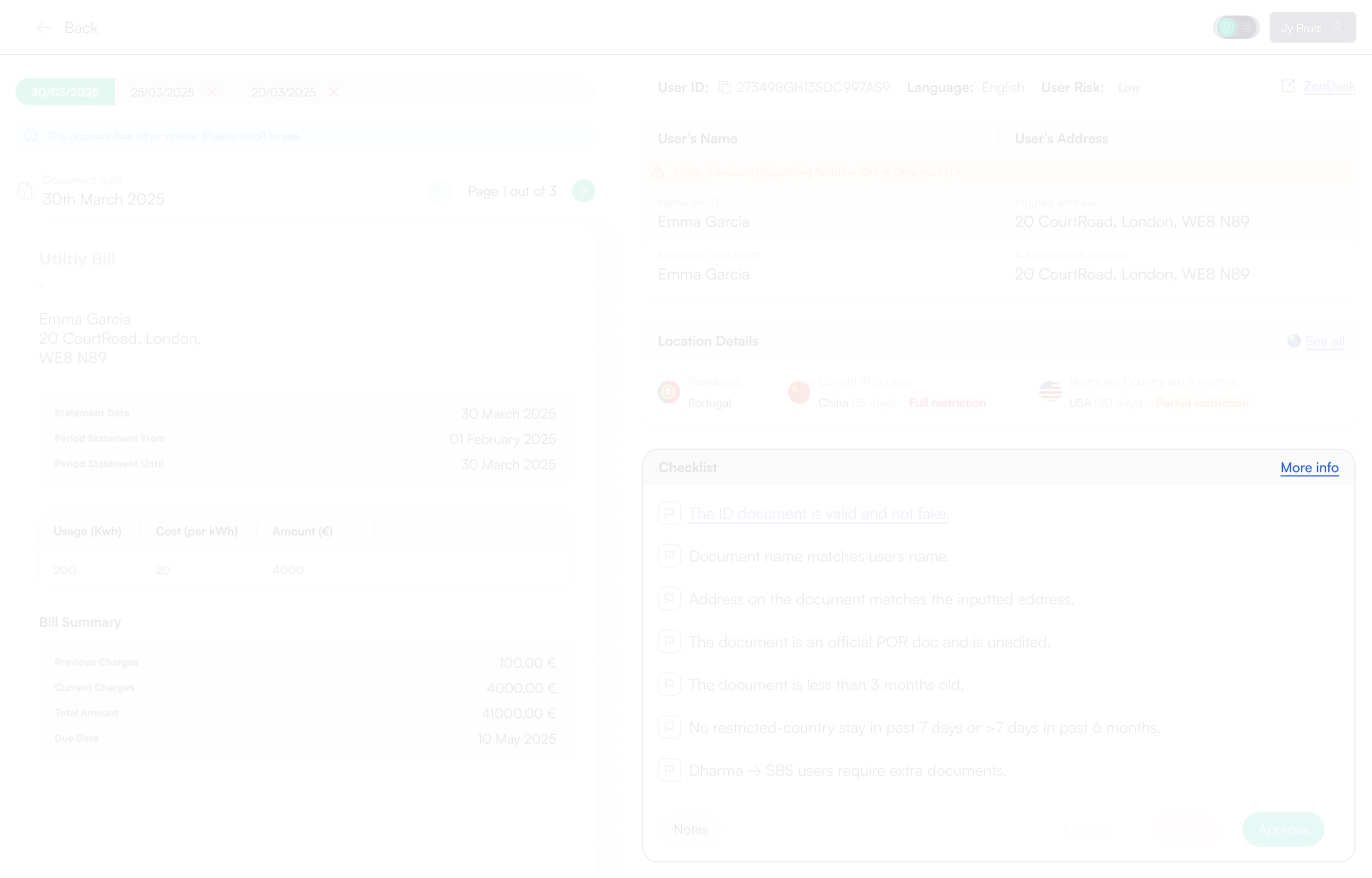
Agents were constantly changing so once the agents are replaced the new agents wouldn't know there was a legacy back-office. However we did have agents who were employees and not contractors and who have been in the company since the very beginning so one option is to ignore them and they get used to the new guided format of making decisions.
We sat down with the agents, listened to their concerns, and agreed on a gradual rollout. The new flow was introduced alongside a "More info" link to the legacy back-office, giving agents time to adapt. After one month, the legacy link would be removed, allowing the new experience to become the default without forcing an abrupt change. Something so simple, yet saved a lot of internal friction.
Handing off the designs for development
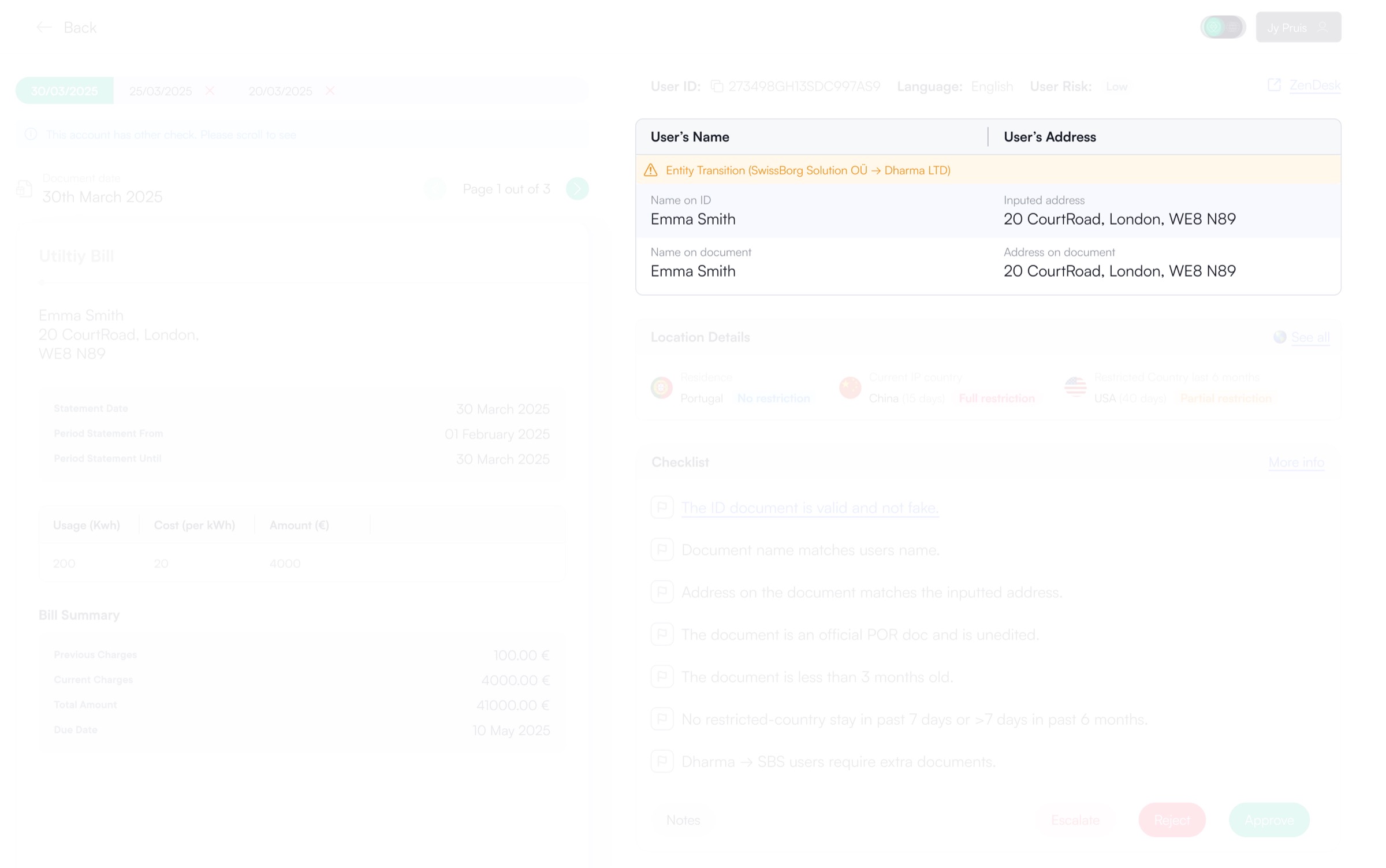
Design hand off was simple and efficient. The designs on Figma were flowed with arrows and wrapped in a section. I kept in constant contact with the web developer and kept track of the build through our stand-ups as well as making necessary changes whenever needed such as an agent coming to me and my product Manager stating that they need to see if the user has swapped from SwissBorg Solutions entity (EU, UK and Swiss) to Dharma (outside EU).
My thoughts on this project
This project reinforced how often performance issues are framed as people problems when they are actually system problems. Agents didn’t need more training or stricter rules, they needed a system that guided them through the work instead of making them manage it. There were many constraints but I realised for this epic designing internal tools meant optimising for clarity, consistency and decision-making. I am extremely proud of my team and myself for reducing the time agents take to make a decision on a proof application by over 50%. This had to be done quickly and efficiently as we did not want to spend too much time on internal upgrades. If taken further, I’d explore deeper automation around data extraction and risk flagging, but only once the underlying structure is solid and proven to scale.