The problem
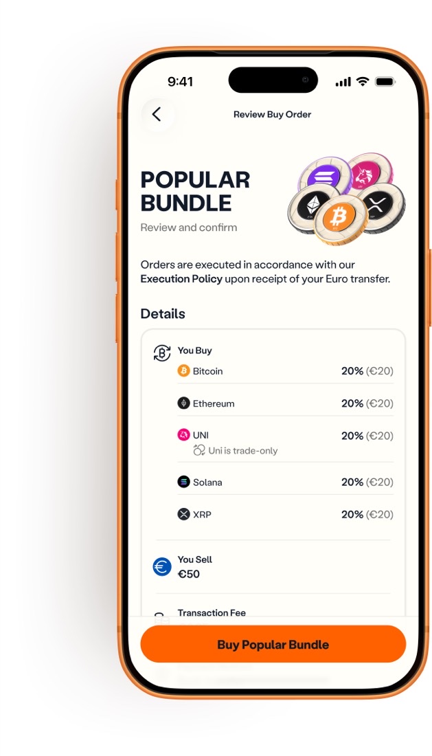
Anyone who wanted BTC, ETH and SOL had to buy three times: three checkouts, three sets of fees, and more friction for what should feel like one investment.
The timing mattered. MiCA was forcing many European platforms to close or restrict services, so users were looking for a new home. SwissBorg, Kraken and Revolut already offered bundle-style products. Venga didn’t.
The constraint: three weeks, two frontend developers, one backend developer, no product manager and no researcher. I had to make product decisions fast without creating problems for engineering later.
What I designed
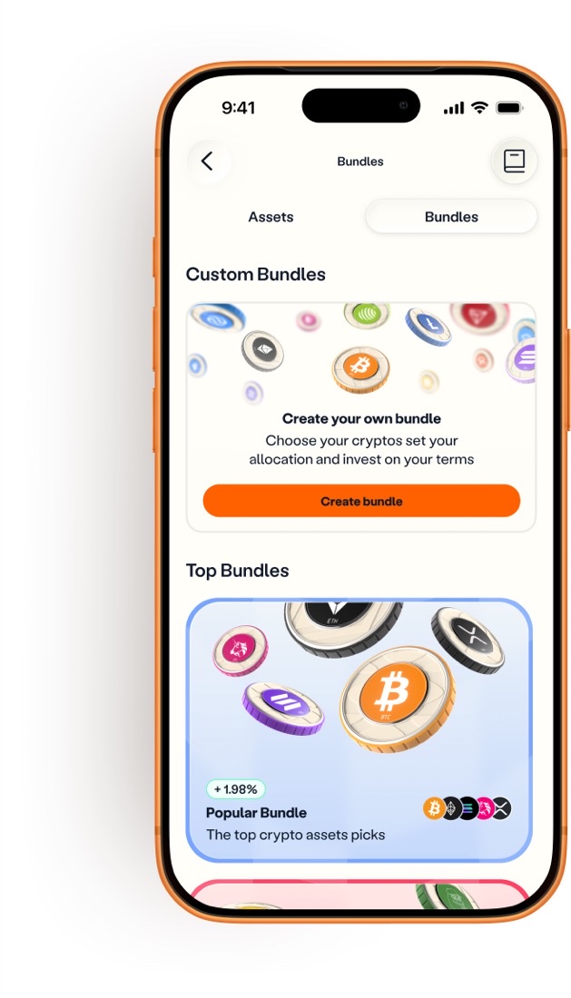
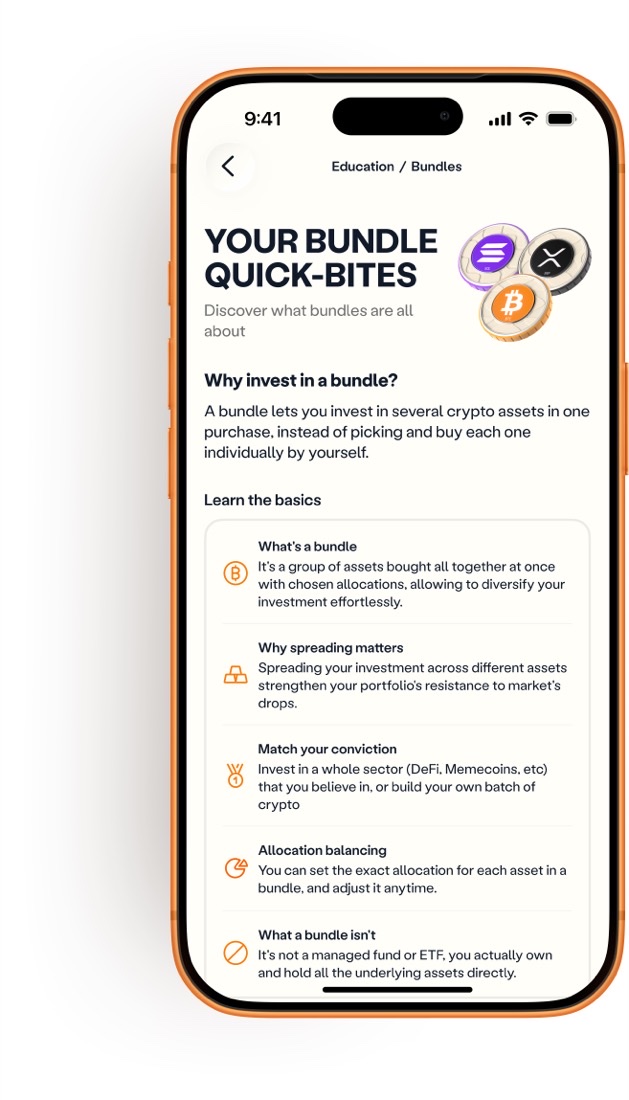
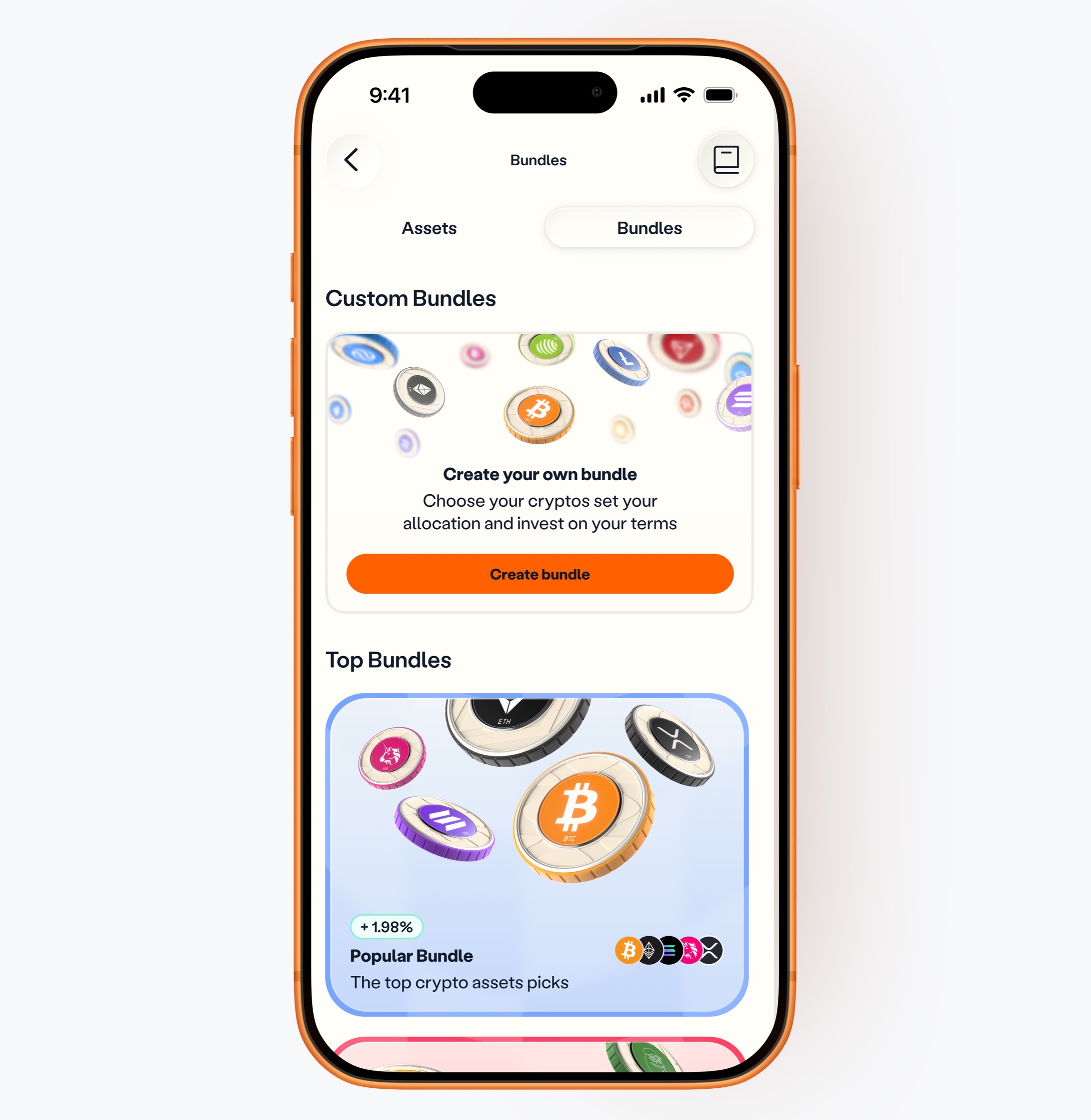
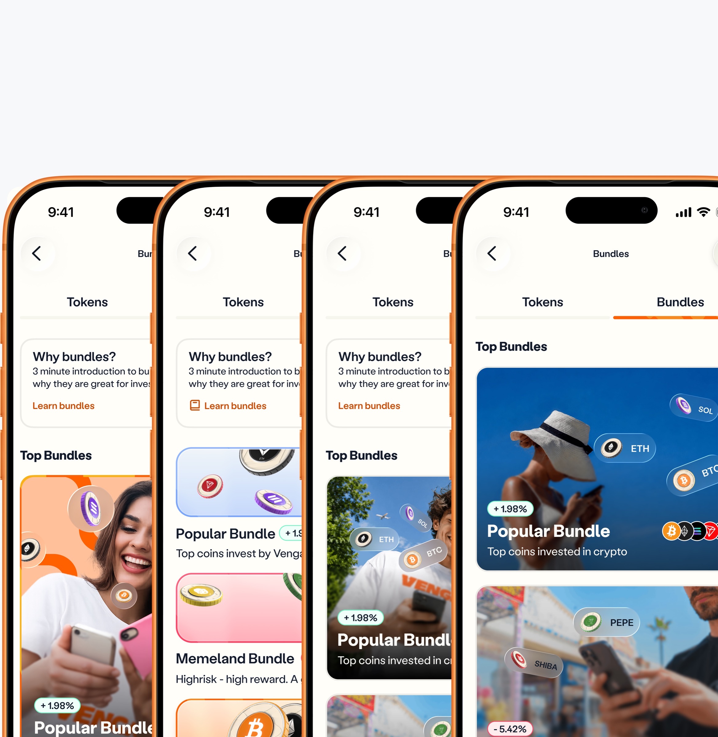
Bundles let users diversify across several cryptocurrencies in a single checkout. In practice, I designed six things.
Bundles a small team could actually run
A way for Venga to offer bundles without the resources of a big exchange: no curated portfolios to keep rebalancing and no new checkout to build.
Custom bundles, which competitors don’t offer
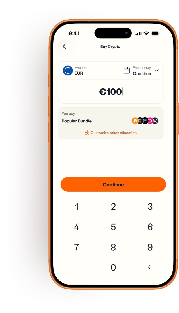
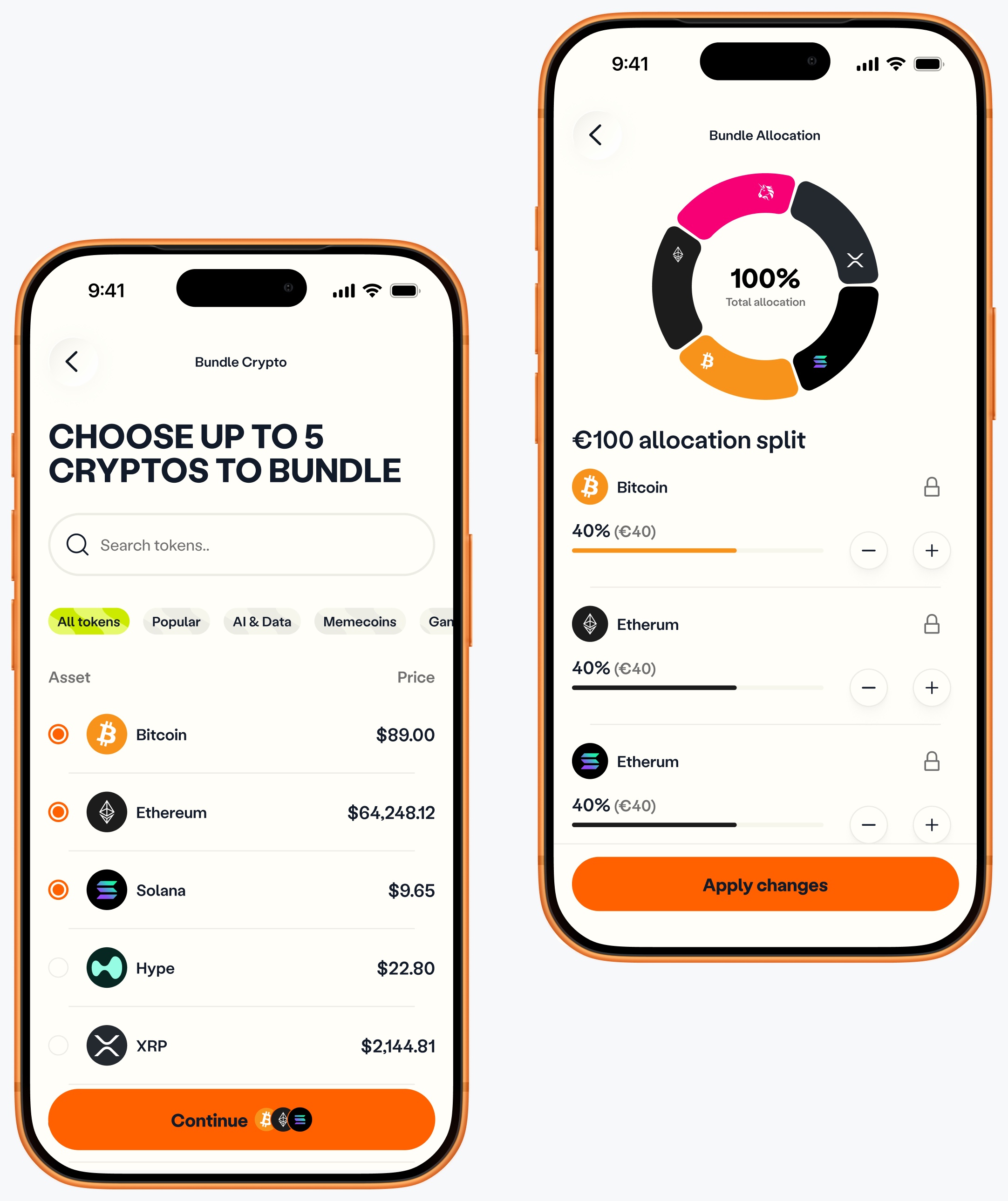
Users choose their own tokens and set the exact allocation for each one, instead of buying a portfolio the platform picked. None of the competitors we reviewed offered this.
Per-coin performance inside every bundle
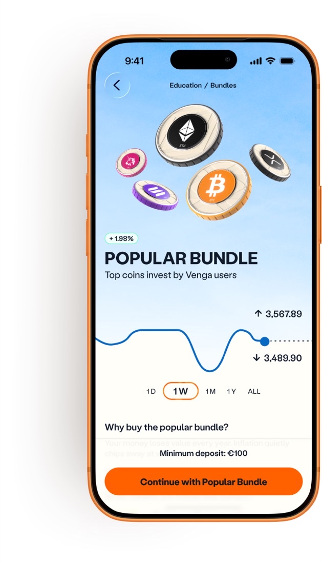
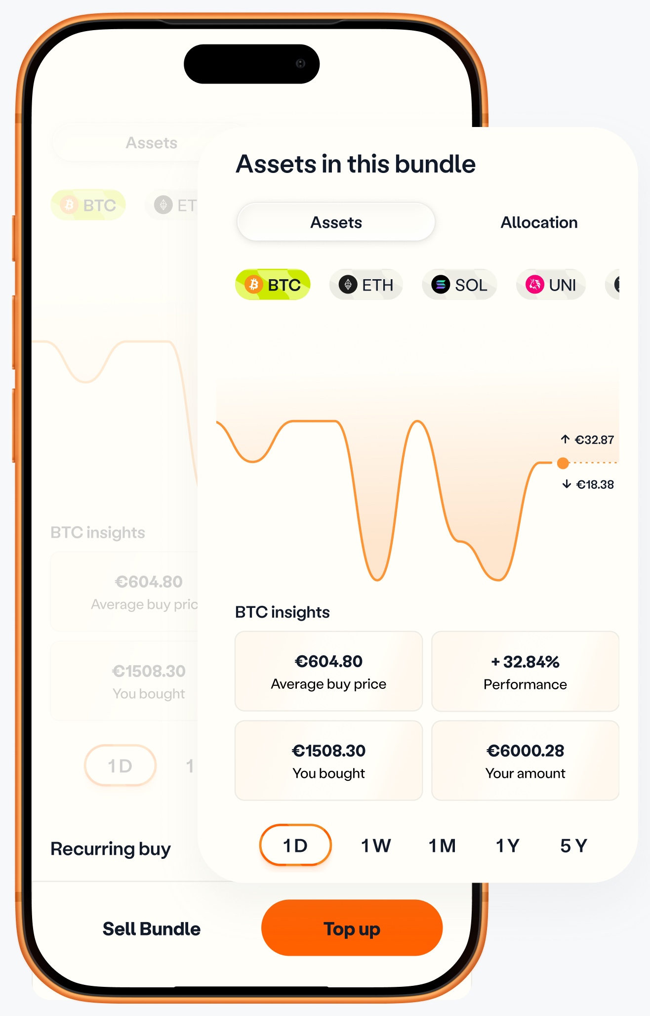
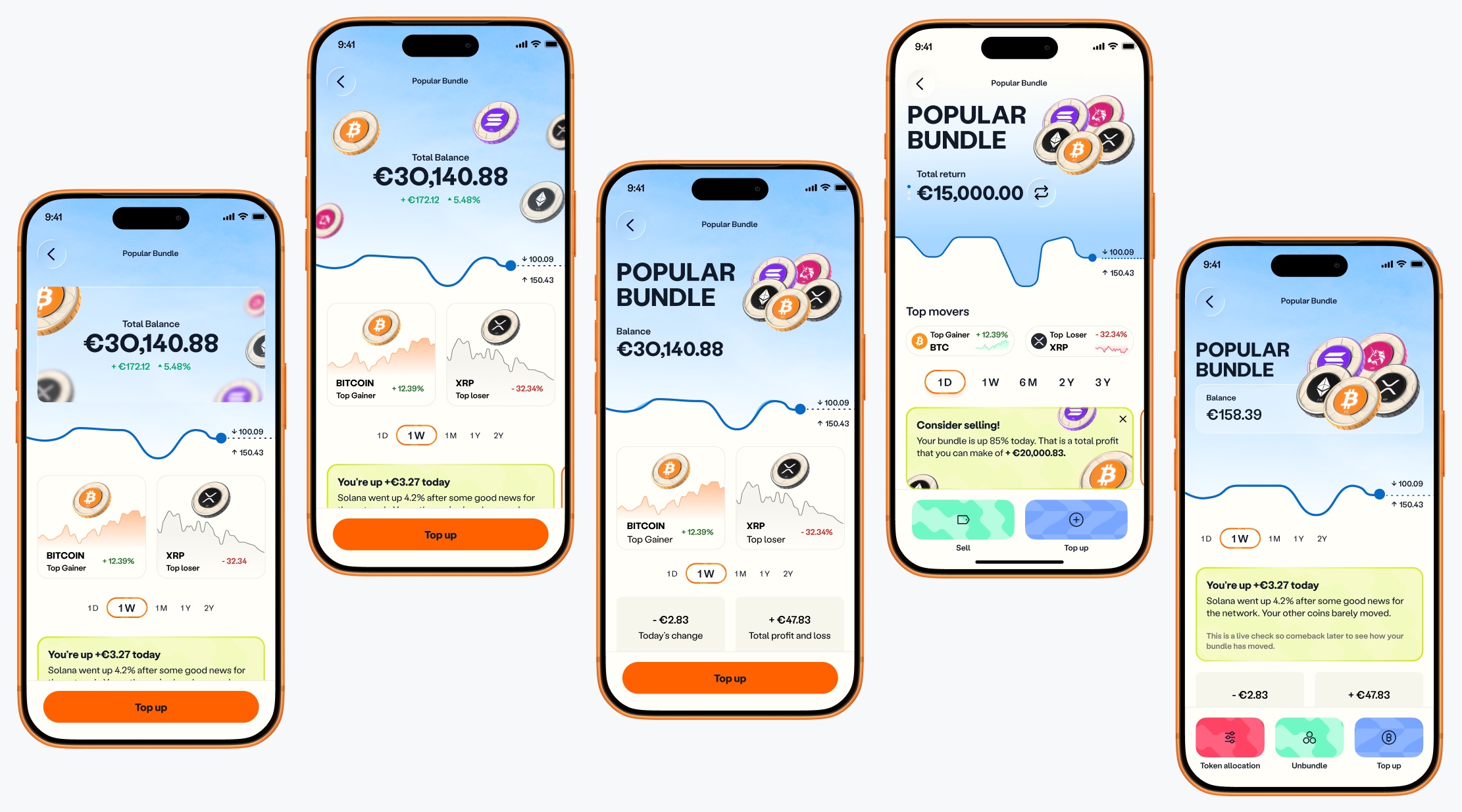
Users can see how each coin in their bundle is performing, so they can use those numbers to plan their next move.
A dedicated bundle wallet
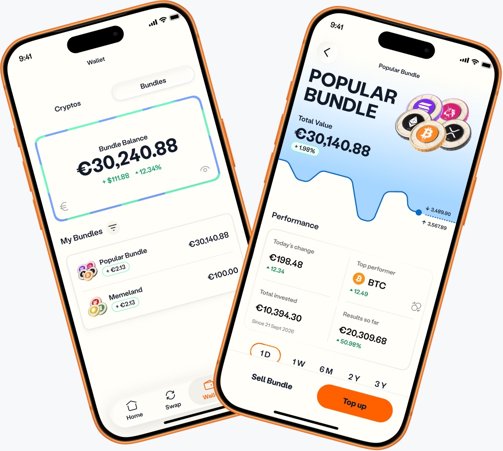
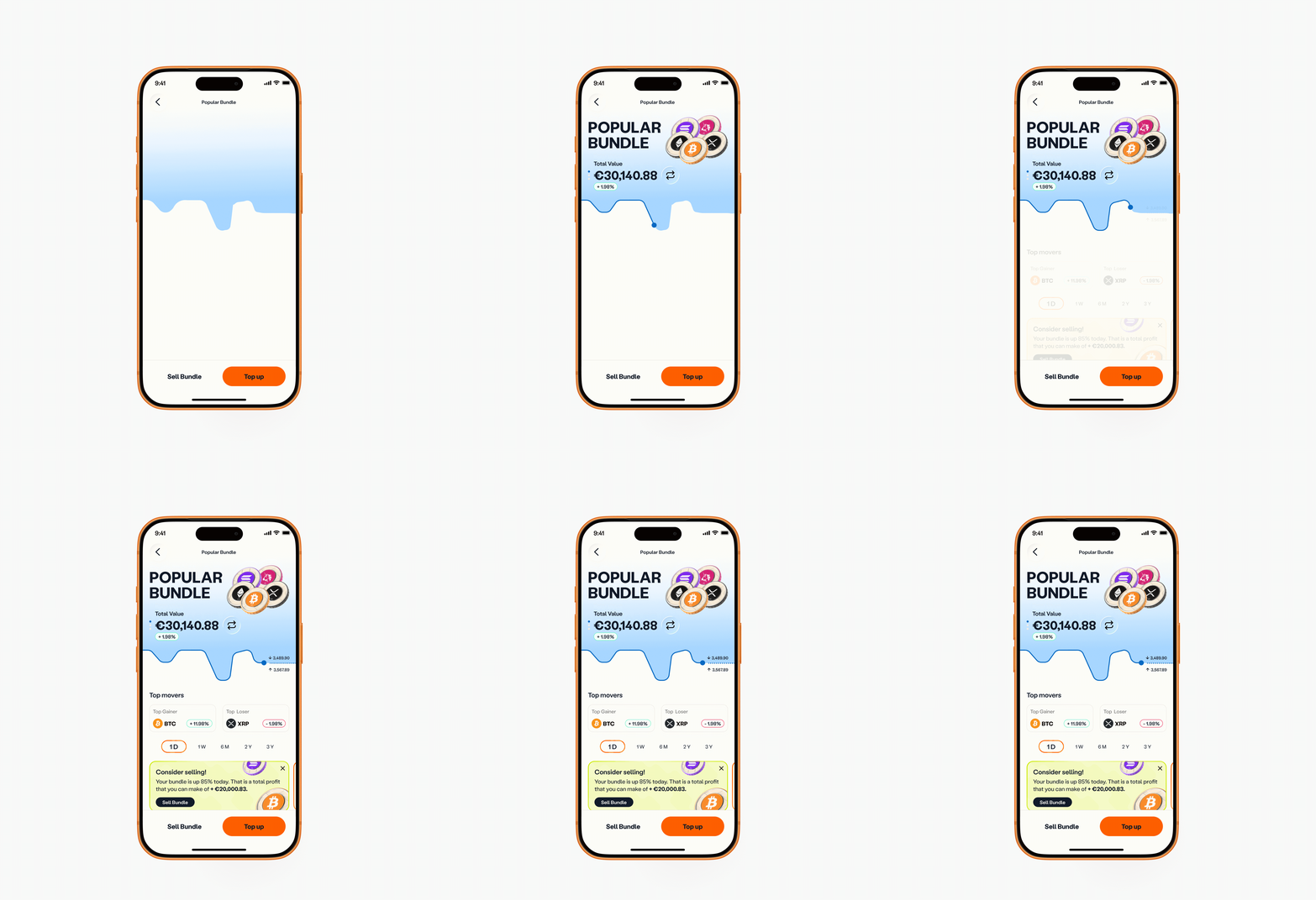
Each bundle has its own wallet, where users can see its metrics, allocation, history and transactions, and top it up or sell it from the same place.
Education on every pre-made bundle
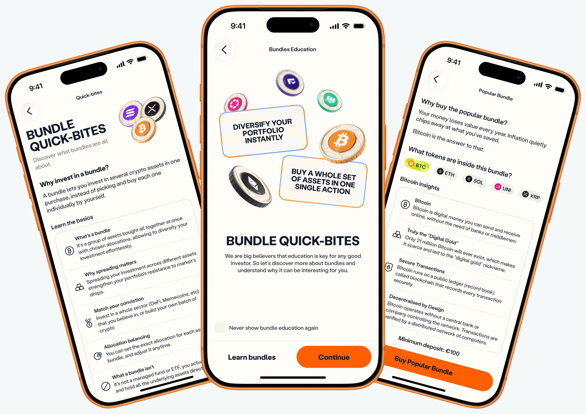
Each pre-made bundle explains what every coin in it is for, so users understand exactly what they’re buying.
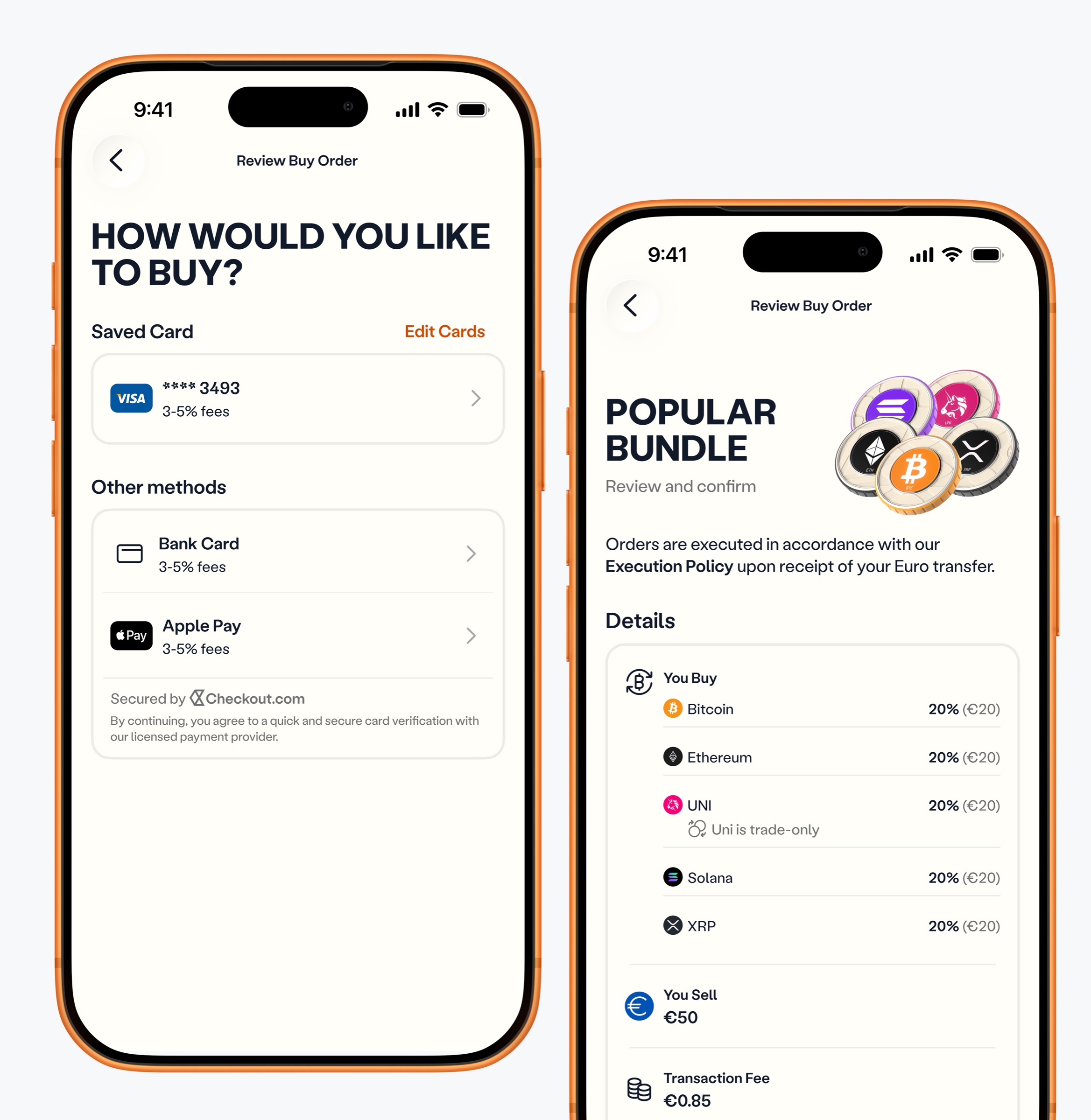
Built on the existing buy and checkout flows, with recurring buy subscriptions
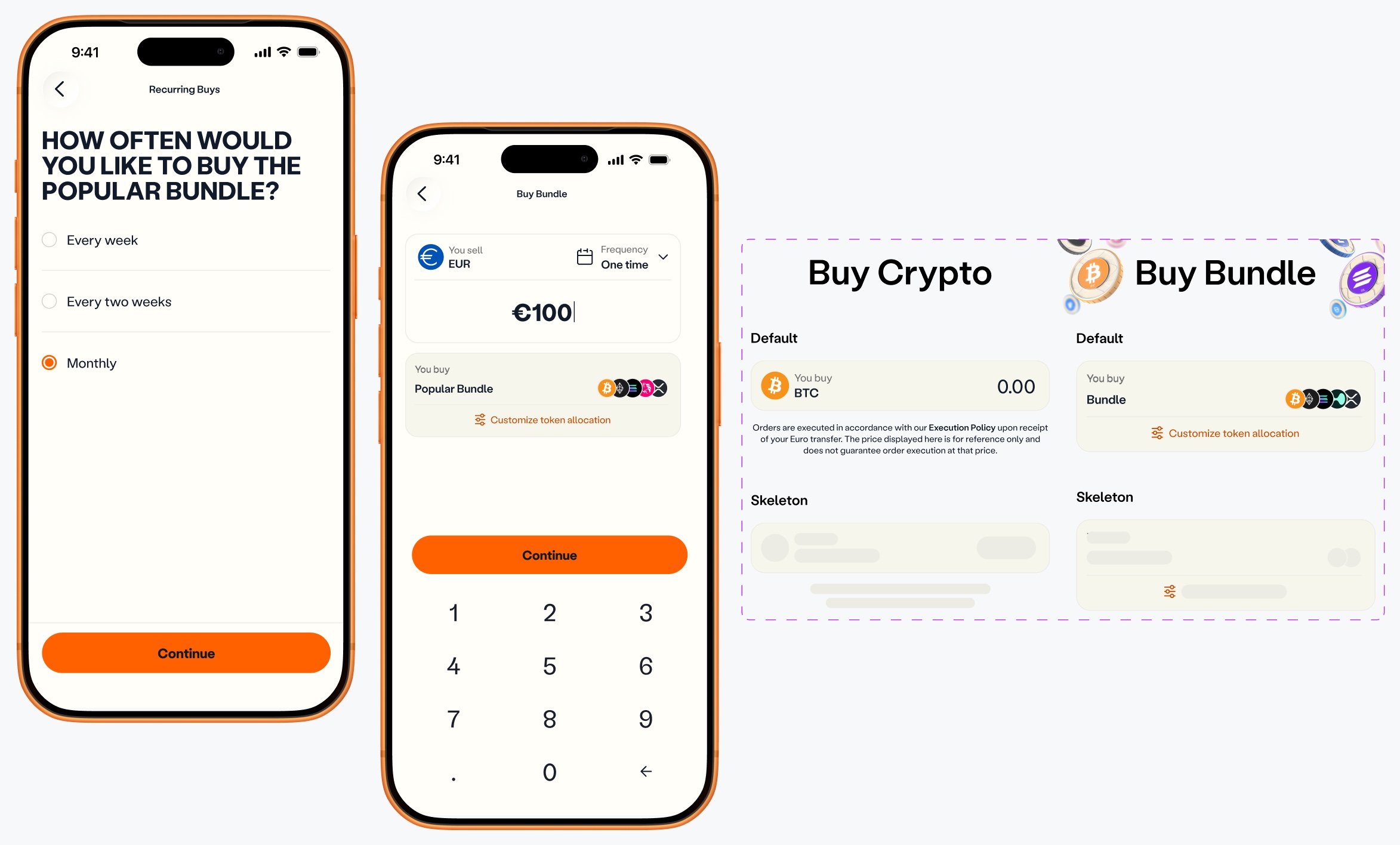
I adapted and reused Venga’s buy flow, which kept development fast and the experience consistent, and connected bundles to recurring buys so users can subscribe to a bundle.
Owning the product
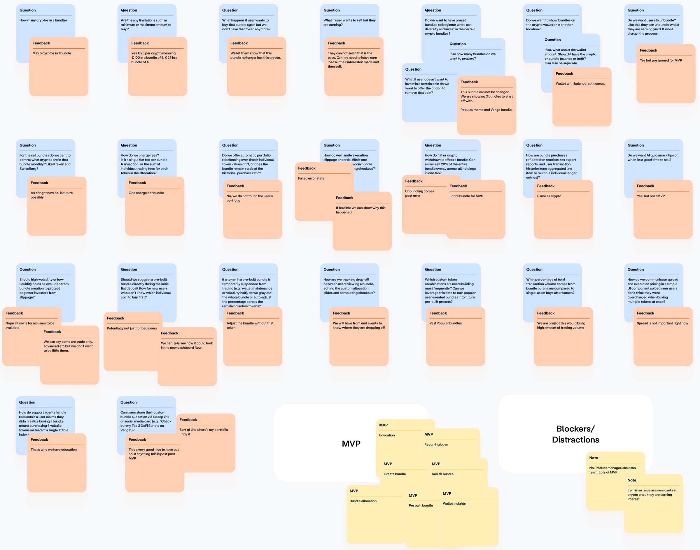
The idea came from the C-suite as a way to create a new revenue stream and give users more value. There was no brief and no product manager, so I stepped in as owner. Besides designing the interface, I defined the MVP, the problem we were solving, how the bundle model should work, what to build now and what to leave for later, and how it fits into the existing product.
Key decisions
Let users build their own bundle
Competitors had validated the idea, but their bundles were mostly portfolios the platform defined. I compared how they handled it:
Platform-defined bundles
Users pick a theme (AI, RWA, memecoins) but can’t choose the assets, set the allocation or swap a coin. It feels more like a managed portfolio than a bundle.
 Venga’s approach
The simplicity of one investment, with the user choosing the coins and the split.
It also made business sense. Venga couldn’t afford to keep updating curated allocations, and a user-set allocation removes that maintenance. Custom bundles became the product’s main difference, so I moved “Create custom bundle” from the bottom of the list to the top. If it’s your biggest difference, don’t hide it.
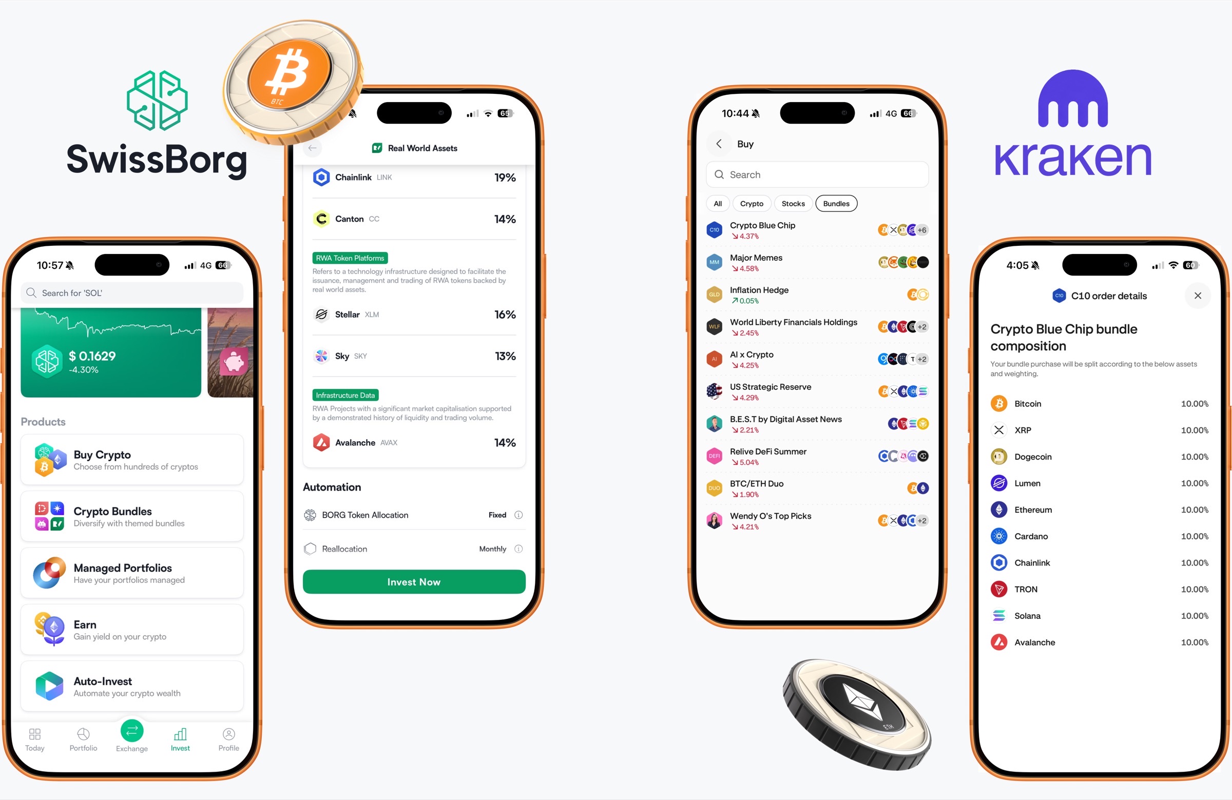
What did I learn from these competitors
That became the foundation for Venga’s approach: give users the simplicity of one investment while letting them choose the assets and allocation themselves.
Users were largely limited to portfolios defined by the platform.
- No allocation
- What you see is what you get
- Invest in coins you might not want to
- The platforms interchanges cryptos
- Based by categories: AI, RWA, Memecoins etc
- It’s just like buying an individual crypto
- Can’t choose or swap out an asset
- More of a managed portfolio than a bundle of cryptos
- No explanation on which coin you are to invest in
First-hand insight from SwissBorg
Having worked at SwissBorg, I knew their bundles had low adoption and they were considering removing them, partly because of the upkeep. That made me question the curated-portfolio model and push for a more flexible approach: bundles built into the existing crypto buy flow, rather than living separately from the cryptos, with users choosing the coins and the split themselves.
Defer Earn, and tell the CEO why
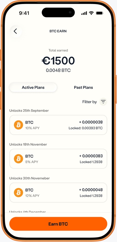
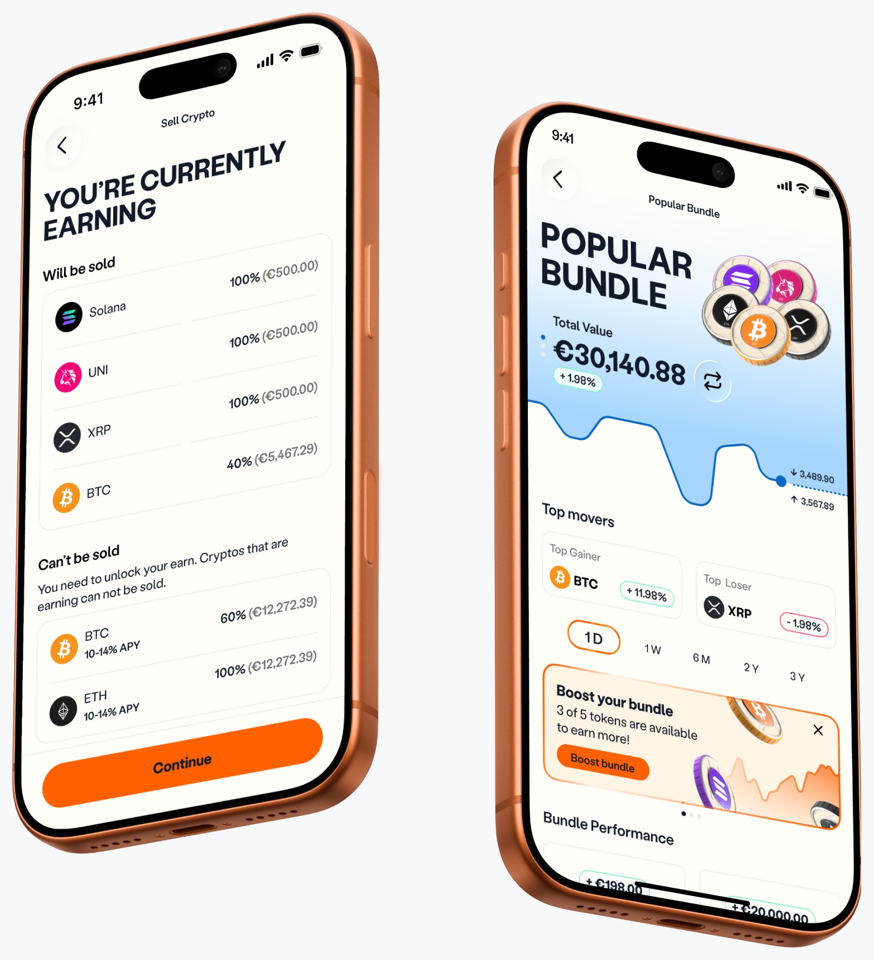
Leadership wanted bundles to earn interest automatically on recurring purchases, so I looked into how it could actually work. In Venga’s Earn, every deposit runs as its own plan, with its own lock-up period, interest rate and unlock date. Someone buying a five-coin bundle every week would collect five new plans a week, and their bundle would end up partly locked and partly sellable. A simple “Sell” button would stop being simple.
In the end, Earn just wasn’t feasible for the MVP
I spoke with the Earn product manager about when they planned to release flexible Earn. I then took it to the CEO, explained the pain points of having so many different lock-up periods, and recommended we defer Earn until Q4, when flexible lock-ups would exist. Leadership agreed, which saved an estimated two weeks of engineering work and kept the launch focused.
Test the interaction, not just the screen
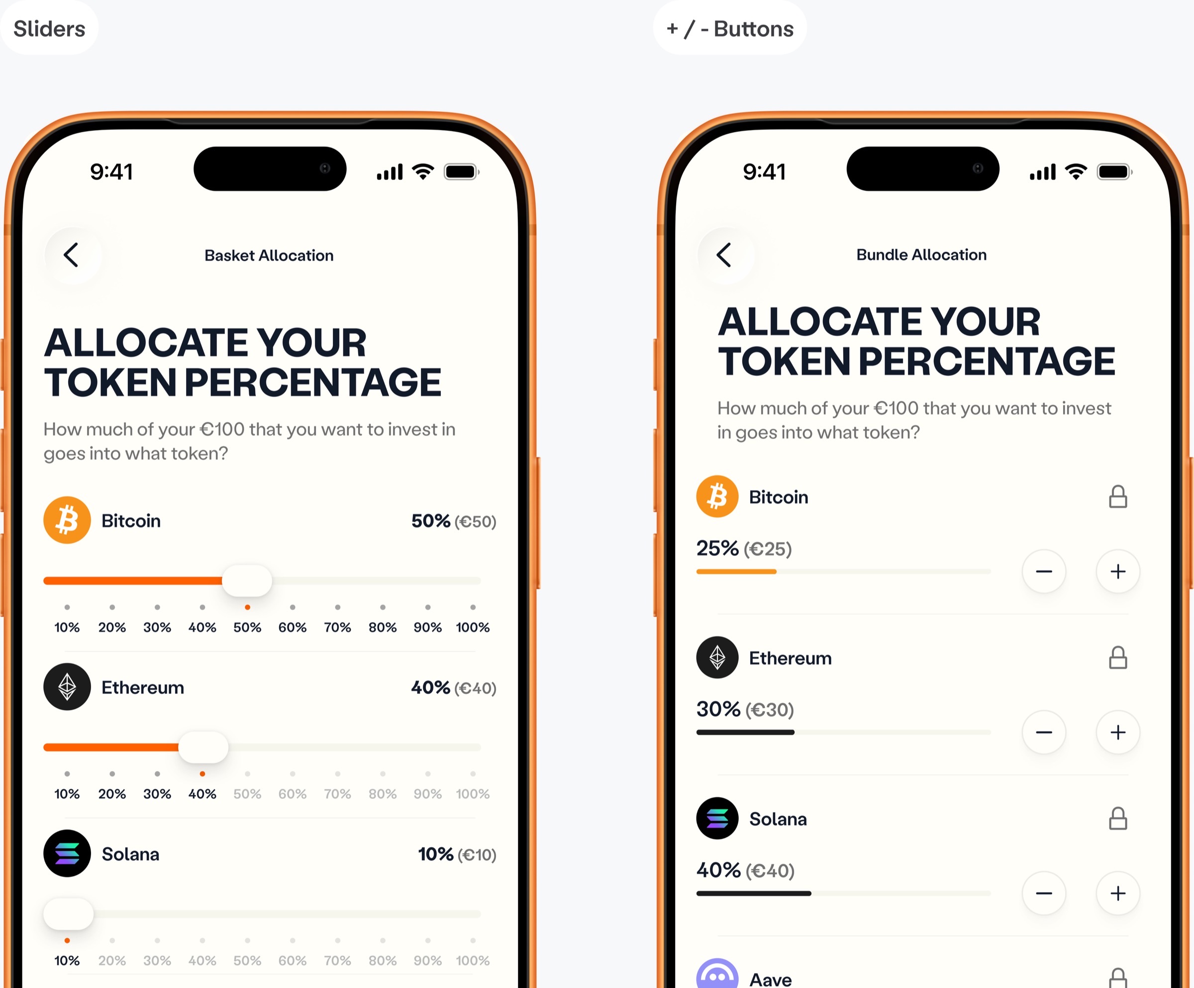
My first idea for setting allocations was sliders. They looked fine in Figma, so I built a quick prototype with Claude Code to see how they felt on touch. Values didn’t lock cleanly when released, which made the interaction frustrating and imprecise. I wouldn’t have caught that from a static design.
I replaced them with + and − buttons and a lock. If a user locks BTC at 50% and changes ETH, BTC stays at 50%. It’s easier to understand and more predictable.
Make bundles part of the buy flow
I didn’t want bundles to become a separate product that people have to find. Users already understood Venga’s buy flow, so I built bundles on top of it. The goal was that buying a bundle should feel like buying a crypto. That let us reuse existing checkout components, helped bundles work with recurring buys, and cut the new engineering work needed in three weeks.
Scope the sell flow to what we could build
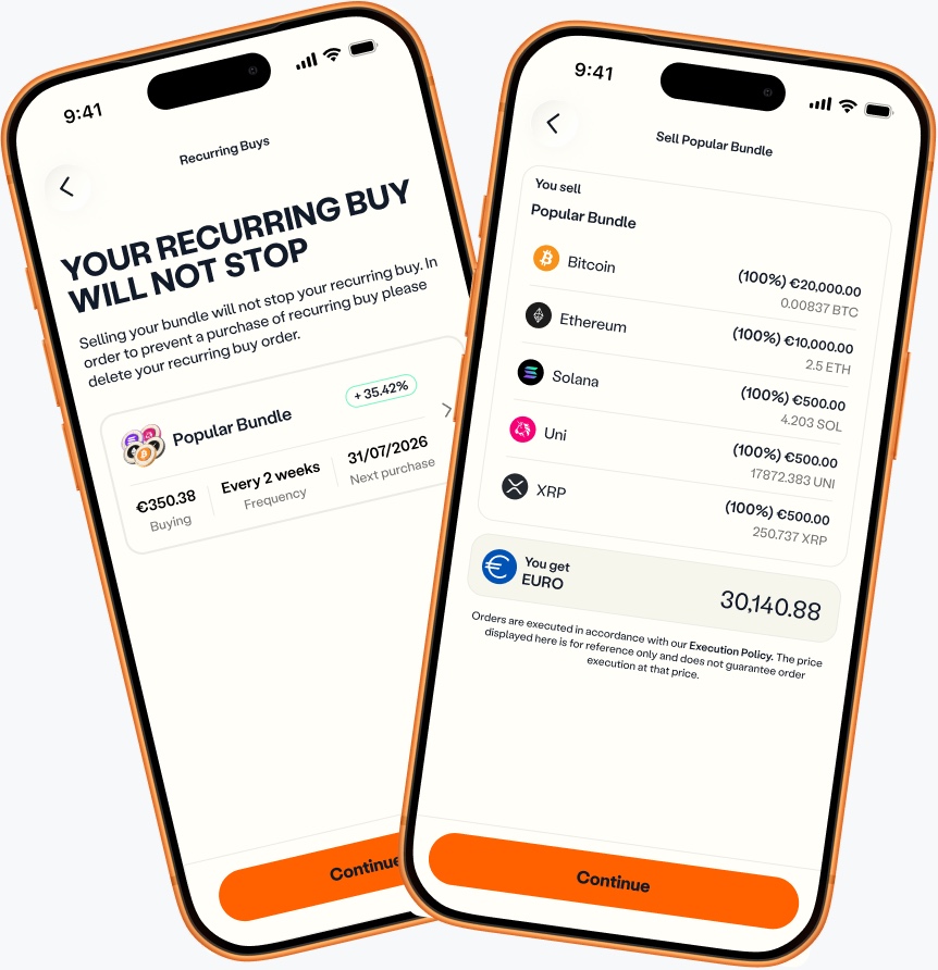
Partial selling needs real-time recalibration of balances and cost-basis tracking for each asset when users repurchase. To hit the deadline, the MVP lets users sell the whole bundle, with partial sells planned for later.
Selling a bundle doesn’t pause an active recurring buy. A button to cancel it was out of scope, but I didn’t want users surprised, so the sell screen links straight to the recurring buy, where they can cancel in three taps.
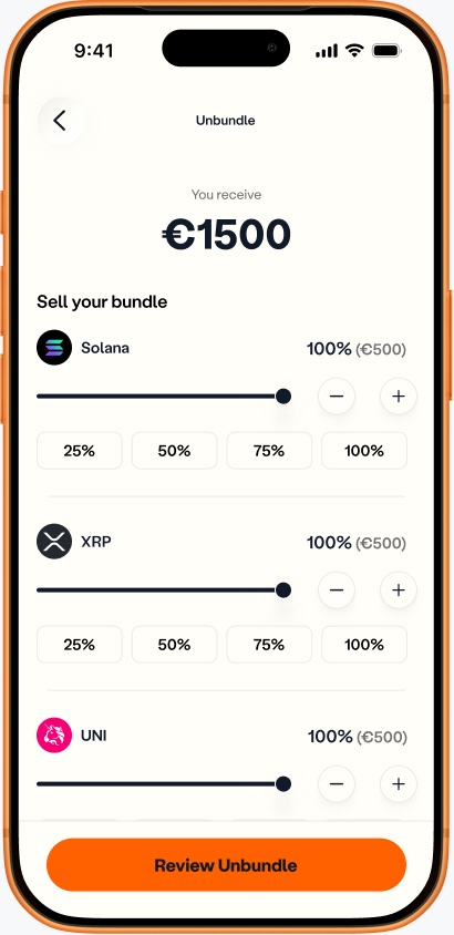
I also looked into partial unbundling, but it raised more questions and complications than the MVP could absorb, so we’re addressing it after launch.
Keep the bundle info above the fold
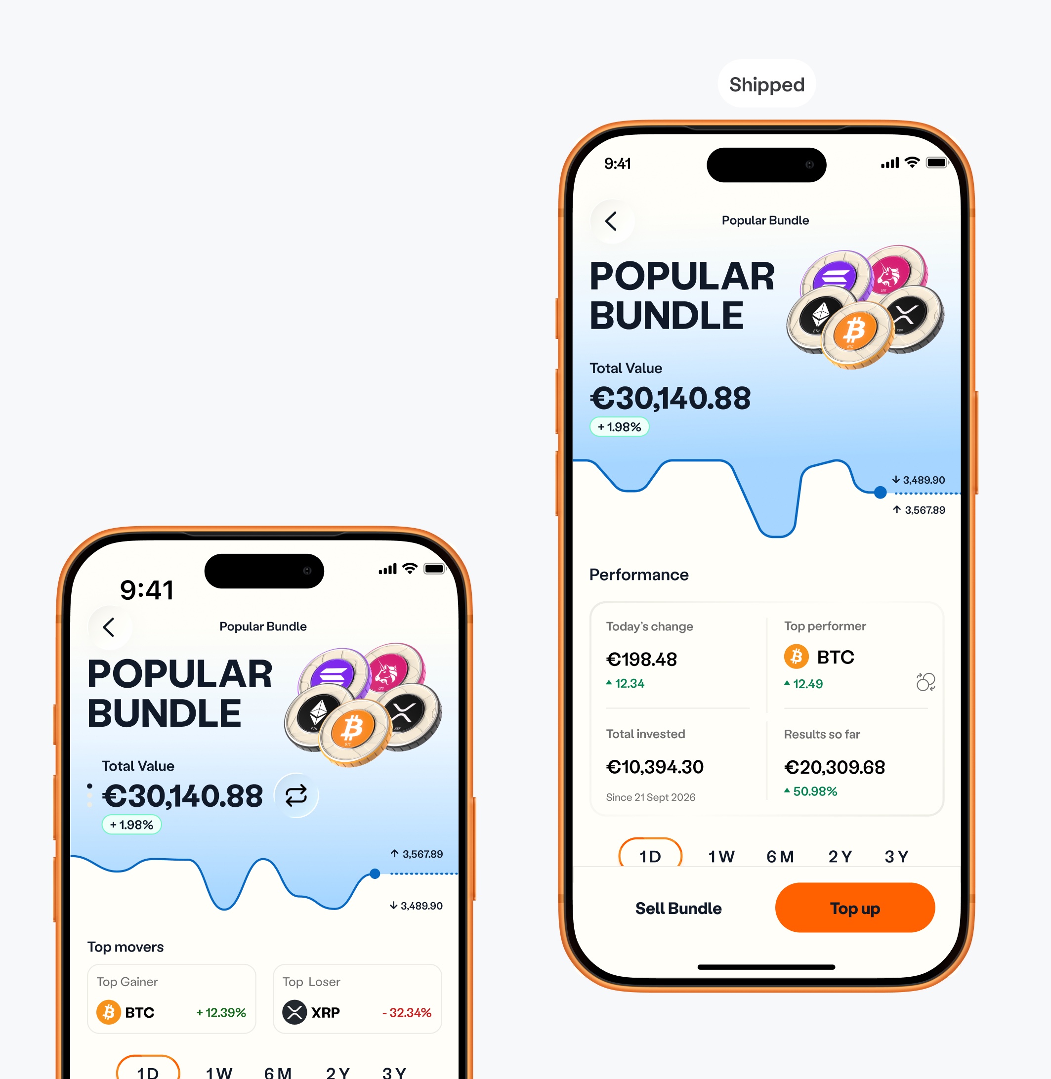
The CEO wanted a dynamic header: tap a button and it would switch between bundle value, total profit and the other figures. I pushed back. Useful information shouldn’t be hidden behind several taps, which only adds friction and frustration. Everything a user needs should be visible at a glance.
The one place I did make it dynamic was the top performer card. To fit both the best and worst performing coin into the same space, users tap the swap icon to see the top loser.
What I explored and dropped
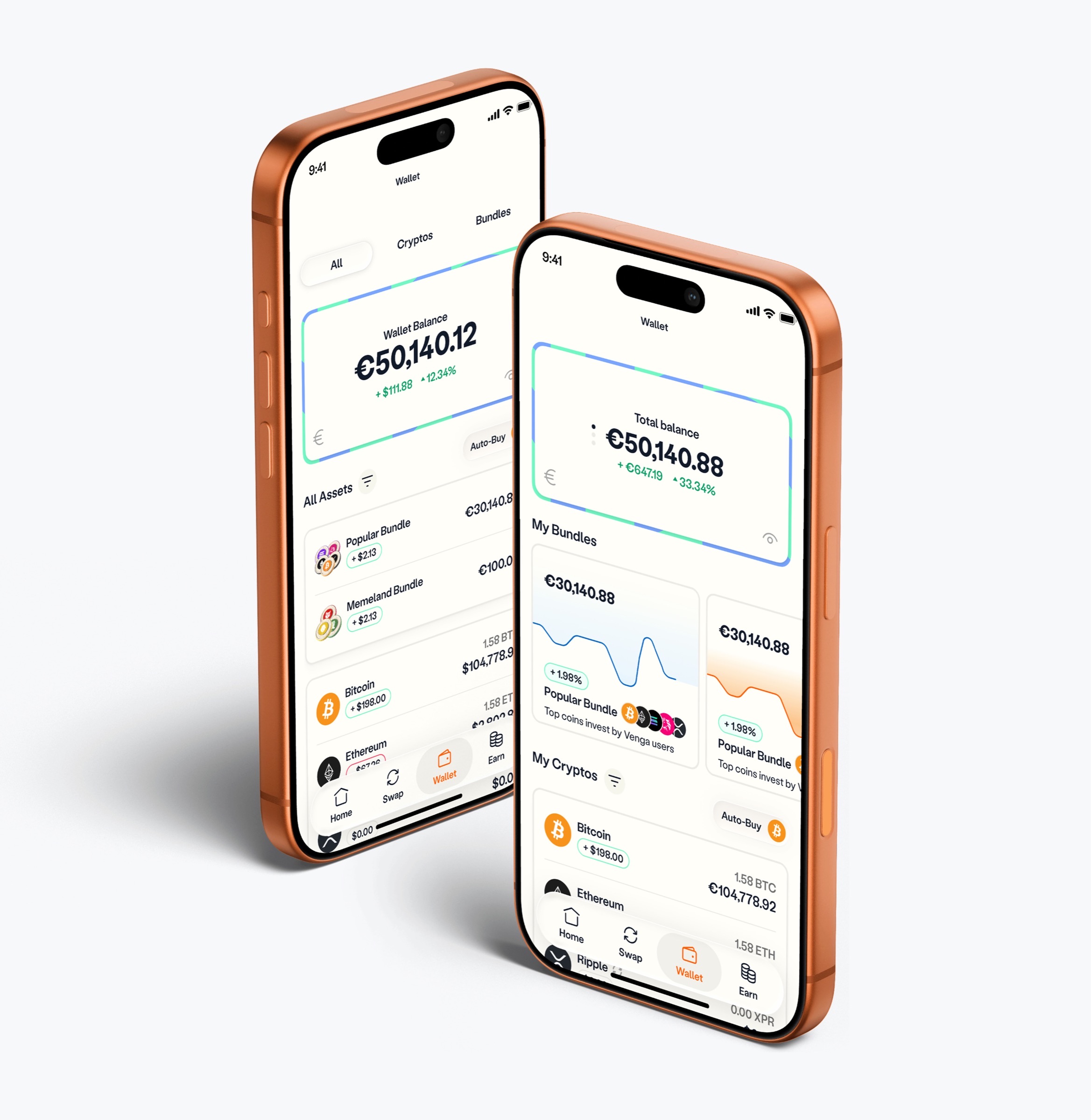
- Bundle wallet entry. Side-scrolling bundles, merging them into the crypto list, or a rotating balance card (total, crypto, bundles). Each added clutter or repeated the dashboard balance, and we didn’t yet know whether users would hold two bundles or ten.
- Large token elements on the wallet. They made it clunky without giving users more value. I kept the wallet focused on what people need to check.
- 3D and patterned bundle thumbnails. They looked good but wouldn’t scale as the catalogue grew, so I used clean token icons.
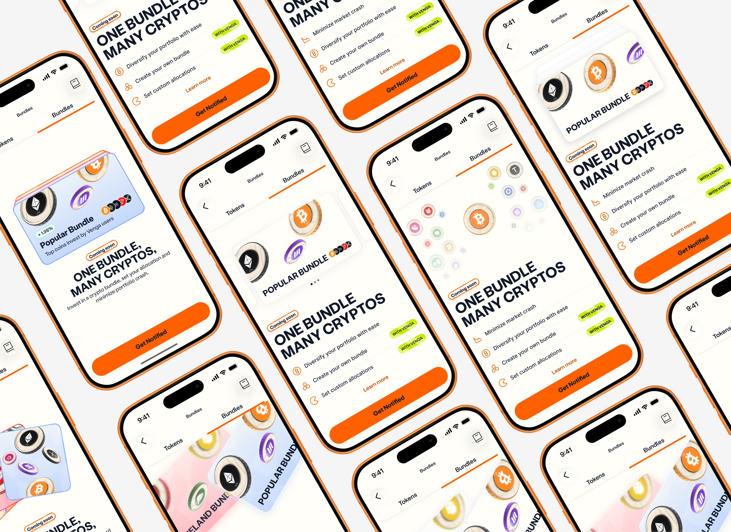
- Pre-launch “Coming soon” screens. I explored screens with a Get Notified button to build interest ahead of launch.
Designing for the system
I reused existing components and patterns wherever possible. This reduced design and engineering debt and kept bundles consistent with the rest of the app. For handoff, the Figma board is colour-coded:
- Flows, happy paths and edge cases
- Iterations
- UX logic and animation notes
- Not in this release
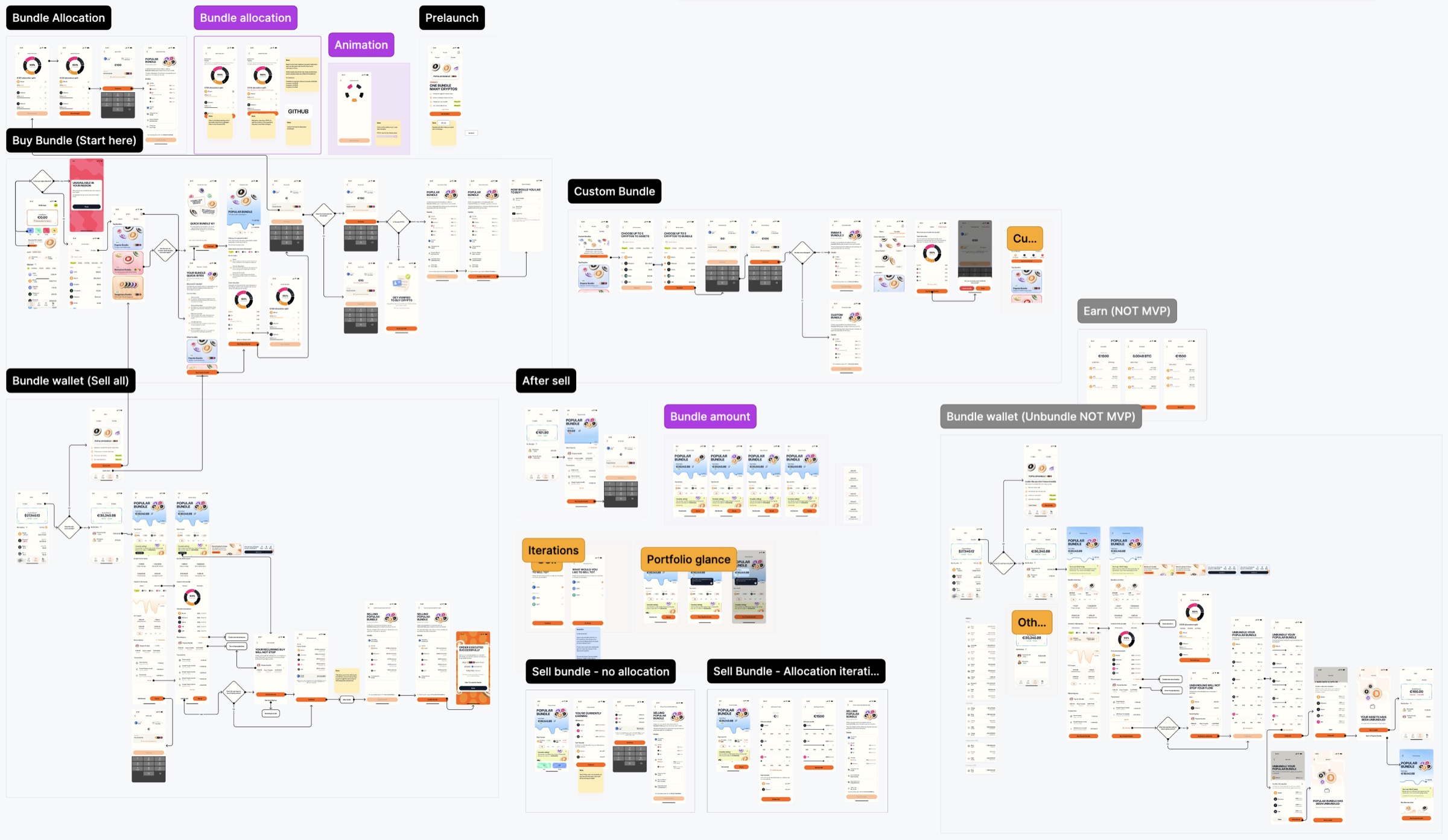
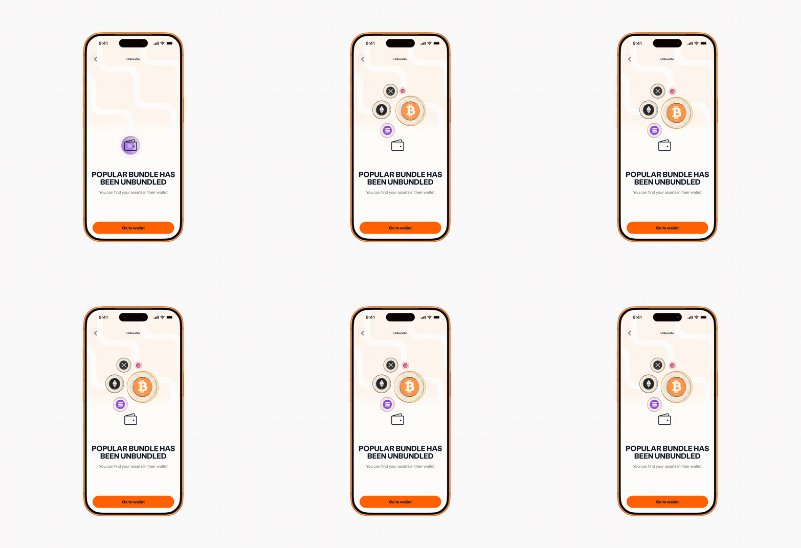
After the MVP scope was set, I used Figma Motion to explore wallet entry and unbundle animations for a more premium feel.
Outcome
An idea with no brief became a defined MVP that the team can build in three weeks, with a clear plan for what comes next: partial unbundling and Earn once flexible lock-ups exist.
The wider recurring-buy ecosystem is projected by the CEO at €50M by 2027. That is a projection, not a result of this project.
What I’d do differently
I’d have liked to interview users to test my assumptions about bundle friction and allocation. With a three-week timeline and around 7,000 onboarded users, structured research wasn’t feasible. I relied on my earlier work on investment products and used the code prototype to test the riskiest interaction. With more time, I’d put the allocation controls in front of real users earlier.
What I took from it
Much of 0-to-1 design is deciding what not to build. Earn sounded valuable until I traced it through balances, lock-ups and selling. The sliders, the wallet and the visuals followed the same pattern: try it, find the problem, change it. Understand the problem, make a decision, test it, and change it when the evidence says so.